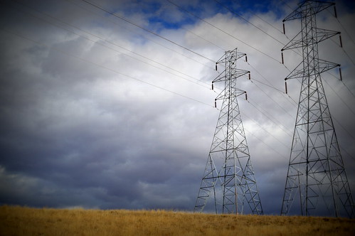
knock knock... I like them all. I love pylons - but sometimes I think overly-moody skies can distract more than enhance. Hence, I'm going with #1 as my favorite, the perspective is nice too...less drama in the sky, but certainly still signs of a storm. Nice work!
Hi Jonothan, welcome to 365. I'm only a point n shoot snapper, but I think the last pic is by far the best. My thinking isn't technical, but I love the cold grey straight pylons against the tumbling chaotic sky. Happy Xmas and I'm following you now x
I'll take the other side. My favorite is D. In the first shot the towers are so off to the side, they seem like an afterthought instead of the main thing...and the rest of the photo isn't that exciting. The storm is too far off yet to make an entrance.
In D, the dramatic clouds make the wires and metal look almost menacing....and it's clear that they are the focus of the photo. C is too dark and B....well, I don't like the sepia tone for this scene...seems a little washed out. My two cents only, and with inflation, that's not worth very much these days.
I like b the best, color really isn't important to this pic and the graphics take precedence. I would have preferred a B&W to the sepia. I don't like how the tops got chopped on the others.
i think for the composition i prefer B - as this one has the most focus on the pylons... i think i would have wanted to try putting them even more in focus (in terms of the subject of the shot) for this type of composition... and i would probably have played more in post processing to get some stronger contrast going (but that's just me... i tend to like high contrast)... welcome to 365 and good for you for just jumping right in :D
I think B has the best composition -- pylons are at the center and the tops aren't cut off. The sky could be more dramatic with a higher contrast. Welcome to 365!
If it is composition that is most important, then the first image with foreground, middleground, and background. If mood is most important, then the forth one with the clouds more defined. Many times it is not what image is better, rather it is about what you want the viewer to see and feel from that image.
I for all the reasons already mentioned. But I would have stepped back a little here even with that one and not cut off the head of the pylon on the right. If you want to do something dramatic with, say, 3 and the B/W and the deep lowered blue content in the sky, crop closely on the large tower to get just the three horizontal arms. The tower here is not significantly cropped at the top, so perhaps you have even more of the top to un-crop.
All have their merits, so I can understand your dilemma. I like B best for its compositional simplicity and the clear focus on the subject. In all of the others, I feel the clouds compete for attention with the pylons.
I'm torn between B & D! @chapjohn I really like how John has answered this. Everyone sees something different. I usually try and go with my gut feel and what appeals most at the time.
I would go with B as well, because in A I think the edges are a little too dark and C is too dark altogether ... maybe you could brighten it up a bit without loosing the dramatic effect in the sky? D is also interesting, but part of the image is cut off...
I vote for B... I think the gold of the grass in A and C distracts from the towers, and the sky/towers in D seem to be competing for my attention too much. For what it's worth, I would hang B in my house! :)
I too would go with the first one. Sets the scene in place with ground appearing as well as the sky. But I could enjoy any of them.
I too am a newbie. Good Luck for 2014
I like one.The tilt of the grass and the wires lead your eye to the pylons.I love the color and tones in the sky and the overall composition.Beauty is in the eye of the beholder for sure.Welcome to 365! It is an awesome community!
I would definitely go with B if it was in color, because the comp feels balanced. I love the sky in A, as well as the light (once I started to really look at the detail of the pylons, A is the best capture of the pylons for me personally because of the light and depth). I think if A didn't have the vignette and the crop wasn't cutting off bits of the far right pylon, A would definitely be my favorite.
First time for me posting in a critique but I really like "A" for the mood and comp. Feels like being in a Kansas wheat field with a storm coming! In a side note, it's so interesting to read all the opinions. So much good information and of course underscores that "it's all in the eye of the beholder!" ;)
I really like A because the grass and the sky go beautifully together but the brewing storm in the background balances it out nicely. I think B would look better if it had some colour but it looks so dark and cold without.
I prefer the first shot. It has a low horizon which captures the loneliness of the landscape and the way you've framed the pylons gives the whole a sense of being part of a larger continuity.
I'm going with A as well. Reasons:
A. Overall exposure is very balanced. Composition is more pleasing and open. The towers seem "tall" and I think that is what you are wanting to do. Including all of one tower helps to show that relation. It is pleasing and not to contrasty...
B. Too close of a crop. It's like a hand in the face. It just says " Bits of pylon" *shrug*
C. Dark moody sky is fun. But overall exposure is far too dark. There is nothing to draw the eye. I feel like I have walked into a dark room and there is no way to turn on the switch. Nothing draws the focus of my eye. Since there is so little contrast in this photo, I actually wonder if it would look more interesting in black and white with contrast altered?
D. Again, bits of a subject, but no real subject. Is the sky the subject? It is crazy cool. But then, if that is the subject, now there are pylons in the way. So the pylons are actually distracting. Since this is backlit, the pylons could be a silhouette shot... but, the angle is too claustrophobic.
I vote for a combination of A and B.
I think the composition is better on A. I think the ground included completes the picture. But I would like to see if in B&W (just my preference there).

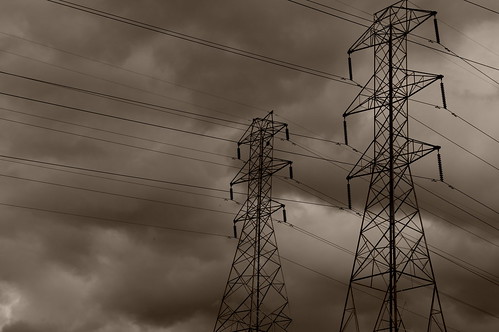
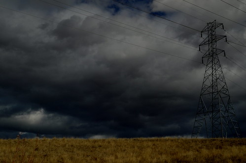
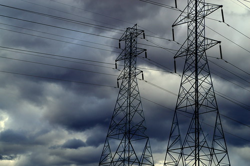
In D, the dramatic clouds make the wires and metal look almost menacing....and it's clear that they are the focus of the photo. C is too dark and B....well, I don't like the sepia tone for this scene...seems a little washed out. My two cents only, and with inflation, that's not worth very much these days.
http://365project.org/jsw0109/365/2012-12-20 http://365project.org/jsw0109/challenges-and/2013-02-19
Very nice photos!
Welcome to 365.
Welcome to 365!
:D
I too am a newbie. Good Luck for 2014
this one for the composition
Kylie - I agree exactly with you.
Welcome!
can,t fail with pylons
think C is best as gives feeling of lonelyness
A. Overall exposure is very balanced. Composition is more pleasing and open. The towers seem "tall" and I think that is what you are wanting to do. Including all of one tower helps to show that relation. It is pleasing and not to contrasty...
B. Too close of a crop. It's like a hand in the face. It just says " Bits of pylon" *shrug*
C. Dark moody sky is fun. But overall exposure is far too dark. There is nothing to draw the eye. I feel like I have walked into a dark room and there is no way to turn on the switch. Nothing draws the focus of my eye. Since there is so little contrast in this photo, I actually wonder if it would look more interesting in black and white with contrast altered?
D. Again, bits of a subject, but no real subject. Is the sky the subject? It is crazy cool. But then, if that is the subject, now there are pylons in the way. So the pylons are actually distracting. Since this is backlit, the pylons could be a silhouette shot... but, the angle is too claustrophobic.
So, I am going with A. I really like it actually.
I think the composition is better on A. I think the ground included completes the picture. But I would like to see if in B&W (just my preference there).