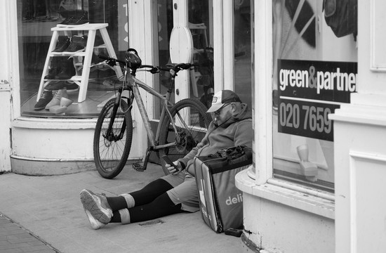
I tend not to do street photography here in the UK but stumbled upon this opportunity the other day in Leeds Centre.
Recently I have not produced black and white images generally however upon looking at the images above, which image gives the best impression of a bit of a rundown closed shop in an inner city centre?
If one was wearing a clean white shirt and rubbed up agains the show frontage the shirt would show the dirt and grime. Which photograph best shows this?
Wow! I just love the black and white. I don't know if you're into tweaking your midtones, but it might bring out more of the grime you want to see in your black and white.
IMO, color adds life. If you are looking to portray 'rundown' you are missing it by showing vibrant colors like teal, pea green, red-orange, and bright white. In fact, the definition of vibrant is "full of energy and enthusiasm." Not exactly what you are trying to reflect here.
This isn't a hard, fast rule...really gritty scenes full of suffering or loss will power through any amount of color. But quiet scenes like this, especially without any visible dirt and grime (you had to point it out in the text), will benefit from B&W.
Thank you all for comments. The idea of the day was to visit Leeds Market for some fresh fish and vegetables and take a series of photographs around the Town Centre showing the effects of lockdown and anything else that was interesting and manifested itself.
I came across this shot and it was a case of turn, point the camera and shoot before the subject realised he was being photographed. It was only when I arrived back home and started playing on Lightroom and Photoshop that I looked at the photograph in a bit more detail.
Incidently a good day overall; two for scenes from the road and two for the Street Photography Challenge, plus many others too.
Dove tailing on the above comments I am reminded of the often quoted photographer (Ted? Todd? Can't remember his first name) Grant, "When you photograph people in color you photograph their clothes. When you photograph them in black and white, you photograph their souls." I believe this principle holds true in many genres. If you want to get tot the "soul" of the picture, black and white will probably be the means to do it. The color shot does not convey the desperate situation you describe in your commentary- the fact that you had to explain it makes that very clear. But the black and white version automatically presents a certain mood not evident in the color version. I think you could work on the contrast and perhaps even add some more grittiness to it (not a lot but some to accentuate the mood you felt upon seeing this) but black and white imho is the genre to portray this scene in.
I didn't think I would say this as I am an avid fan of b&w but if you are just looking for which shows the dirt and grime more, in this particular image I think the color has it. something about the b&w sterilizes it a bit, making the white whiter and losing some of the barely there color differences between some of the dirt and the other colors in the photo. also something about the colors they make me look around the scene a bit more. I think I focus more on the gentleman in the b&w and have to be more intent on looking away from him to see other things in the frame. just mho...
Free form thinking:
If you are wanting to emphasis the person, I would add the possibility of using the b&w as a background and the person in colour. slight blur to the B&W. And perhaps de-saturate the colours so that you only imagine that there is colour. This is based on my observation of the cell phone in his hand.
For me the colour of the bike and the Deliveroo box really makes the photo not about the shop but about an 'employed' person waiting for their next job
I'm usually partial to b/w anyway, but in this case I do feel the monochrome gives it a grittier feeling. And like Mags suggested, I would play around midtone contrasts to bring out the textures to add a little to the "grunge" feeling of down and out. Color Version 3 is more effective than Version 1 in my humble opinion. It's a great capture no matter how you edit it!
Boosting contrast in either image would result in a more "grungy" look. Removing color from photographs removes it as a 'distraction' (i.e. in this case, in my opinion, distraction of the red bicycle fights for the viewers attention and pulls away from the subject and message of the image). When color is removed, geometry in the image has an opportunity to come forward.
I think I prefer the black-and-white one. I agree with the comments about a bit more contrast to bring out the 'grimy' qualities. If that were me, I might try doing black-and-white but with a selective colour edit just on that turquoise/green of the Deliveroo container – since that has become such an icon recently… But that really depends on what you're trying to say with the image, and what you want the audience to focus on most.
Hi John, this is my take. The light is a bit flat. My own taste in street photos is to use the shadows or blacks and highlights to lead frame the subject. I would crop out the pillar on the right. I do like the desaturated image the best. The central colors bring one's eye to the subject. This is not a criticism, but from their omniscience so many people on the street have their faces buried in cell phones. If I can, as hard as it is, I avoid people looking at their phones.
For me, definitely the black and white version is the one to go with. I’m not sure either version conveys the feel of a rundown, inner city shop fallen on hard times that you describe in your commentary but it certainly is a good study of a working man taking a short break. I would like to see a little more emphasis on him which could be achieved with some dodging and burning and perhaps the addition of a vignette.
I like the B&W
I have found this a most useful discussion and I particularly like @olivetreeann comment about B&W revealing the soul. I think B&W focusses attention on the subject and reduces the busyness.
I also think cropping extraneous aspects at the edges would emphasise the subject.
Write a Reply
Sign up for a free account or Sign in to post a comment.


This isn't a hard, fast rule...really gritty scenes full of suffering or loss will power through any amount of color. But quiet scenes like this, especially without any visible dirt and grime (you had to point it out in the text), will benefit from B&W.
I came across this shot and it was a case of turn, point the camera and shoot before the subject realised he was being photographed. It was only when I arrived back home and started playing on Lightroom and Photoshop that I looked at the photograph in a bit more detail.
Incidently a good day overall; two for scenes from the road and two for the Street Photography Challenge, plus many others too.
If you are wanting to emphasis the person, I would add the possibility of using the b&w as a background and the person in colour. slight blur to the B&W. And perhaps de-saturate the colours so that you only imagine that there is colour. This is based on my observation of the cell phone in his hand.
Version 3 - Colours desaturated at edges and top of photograph.
I have found this a most useful discussion and I particularly like @olivetreeann comment about B&W revealing the soul. I think B&W focusses attention on the subject and reduces the busyness.
I also think cropping extraneous aspects at the edges would emphasise the subject.