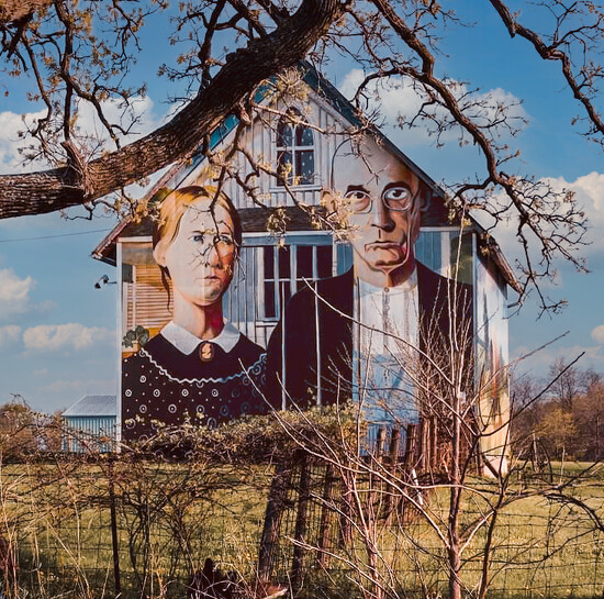
I'm thinking of having this printed and framed to hang in my home. Keeping in mind that I am a fairly new Lightroom and Photoshop user but am trying to learn, what are some things you might do to make this a better photo?
There are techniques/processes in Photoshop for giving texture to the image that imposed on the building. It has been a while since I have used it (the process) that I don't know where to point you for the instructions.
@jasperlovescamping Part of my assumption is that there are several layers to this photo; house with fence, Gothic then foreground tree. if not, texture may add additional complexity to the project.
@byrdlip This is an older photo and at that time the only thing I could do in Photoshop was replace the sky. Otherwise I did some tweaking of colors in Lightroom and that was it.
@lsquared I'll try that. Thank you! Someone in a comment on the photo in my album suggested retaking it from a slightly different position so the branch frames the roof better and I think that's a good idea, too. I might just start over with a new photo.
I would personally crop a tiny bit of the bottom off to center the house, but it's all a matter of opinion.. i love this and can't think of many things to improve:)
@dreary Thank you! I'm torn about the brush in the front. Part of me thinks I should try to remove that dead tree looking thing in the front. Cropping it up is a good idea though.
I feel like the main focus of this picture needs to be brighter without making the background any lighter. I use GIMP rather than Photoshop, but here I did a quick selection of just the main panel on the front of the house and then used the Levels tool in the colors tab to brighten up the selection. I think it brings out the features of the mural without having to do a lot with the extra stuff in the image that might distract you from the main focus.
Write a Reply
Sign up for a free account or Sign in to post a comment.