Now that you’ve had some fun exploring light and texture, Carren moves on to one of the most important components of any artistic medium, composition. Carren states, “Too often new photographers use color as a crutch. Black and white pares a photo down to its bare bones. It removes all the excess considerations. And because of this, its especially necessary that your composition be very strong”.
So here are the elements of COMPOSITION you are to consider with a brief explanation (in Carren’s terms) of them:
THE RULE OF THIRDS
It’s the first rule learned in art class according to the author. It involves taking a photo and dividing it into 9 squares using 2 vertical lines and 2 horizontal lines. The goal is to make sure that the main part of your composition doesn’t fall in the middle square (yes, rules are made to be broken and you can break this rule with the right subject matter! AHL) which would make a picture stagnant and boring in most instances. Ideally you want the main point of interest to fall along one or more of the lines’ intersections. It’s also fine if they fall within the edges of the squares. Carren writes, “The rule of thirds will help you break down this misconceived notion that things should always be perfectly centered, because rarely that is the case”.
LEADING LINES
Leading lines and eye lines are existing or inferred lines that occur within a photo. Carren qualifies this by saying that a line in a photo isn’t necessarily a leading line UNLESS it works to guide the eye of the viewer through and around the photo, and to the most important part of the photo. Pay particular attention to how you frame the photo so that lines keep the eyes moving rather than bringing them to a complete stop.
Eye lines are similar to leading lines but they are implied and more often than not, made when the eyes of two subjects meet or if the eyes of the subject are drawn elsewhere in the photo (such as your dog or cat wistfully looking out the backdoor toward something they’d like to chase). This also helps guide the viewer around or through the picture.
WEIGHT
Weight happens because of where you place your subject. Carren suggests placing the subject where you feel it will have the most meaningful impact.
JUXTAPOSITION
Juxtaposition is the placement of 2 things side by side that are opposite of one another. This relationship can be symbolic or visual (I think he means this in a more literal sense- i. e. you can see the opposite nature of a rock and a feather). Using the rule of thirds enables you to split this any way you want to. Here is another example of how the lack of pictures makes it difficult to understand exactly what he means by this however, I think most of us get the gist of it as it seems to deal mostly with the placement of the objects in your shot.
DEPTH
Depth concerns what is in or out of focus in your picture. A shallow depth means that only the things in the foreground are in focus (at its shallowest). When the depth is deep everything from the foreground to the background is in focus and “tack sharp”. Depth also covers all the variations in between these two extremes. Carren suggests that you “choose depth according to your aesthetic and what you feel is the purpose of your picture”. You should also take all the parts of your picture into consideration when deciding on what type of depth you want your picture to have.
ORIENTATION
Pictures are either horizontal or vertical in their orientation. You will naturally be inclined to one or the other according to Carren. He says it’s a good idea to purposely vary your shots and that if you are an abstract photographer, it might be interesting to rotate your photographs all the way around to see which composition is the most eye-catching. Experiment with photos that are not abstract as well.
BALANCE
Contrary to popular belief, “things do not always have to be symmetrical”. Carren writes that odd numbers of things, or asymmetry creates more interest and tension, therefore they are more pleasing to look at.
TENSION
This section slightly falls short in the descriptive department, but Carren does provide a list of examples: catching a moment such as an argument or just before a kiss, the intersection of lines and shapes, dramatic light, the collision of complementary colors, or the confusion or discomfort caused by 2 juxtaposing elements.
COLOR
Although you’re shooting in black and white, Carren says you should still pay attention to color. This is because different colors show up as different tonalities of gray in black and white.
FRAMING
Framing is how you choose to place your subject within the picture plane.
SHAPE
Carren writes, “Pay attention to what shapes lie within the picture frame and if they repeat whether they are basic shapes (such as a square, triangle or circle), or more complex. You can even use the subject itself to create shape. (An illustration would have been helpful here too.)
You may find Carren’s overview on composition short on complete descriptions, and of course the lack of examples can be frustrating at times. Here are some links to articles for further reading (with examples!) if you’d like to know (and see) more:
Compelling Photographs: The Elements and Principles of Design by Alasdair Gillespie:
http://luminous-landscape.com/elements-principles-design/
Is Your Composition Up to Scratch? by Damon Guy:
http://www.photokonnexion.com/is-your-composition-up-to-scratch/
Carren moves quickly from composition to HEADSHOTS, a specific type of portrait which mainly features a person’s head (and sometimes the torso). Carren says “headshots in black and white are classy and timeless”. Like choosing to shoot a landscape or macro, choosing black and white for a portrait is an aesthetic choice. If you are careful with the attire that your subject is wearing you can convince the viewer of any time period without the input of color- that is your picture becomes timeless.
What should you specifically pay attention to when shooting a portrait in black and white? Carren lists three things: lighting, background and texture.
Concerning lighting he says whatever you have available to you can be used to make creative headshots, whether it is one light or five. Two lights are typical for most headshots; one light to illuminate the background and one light on the hair as rim light near the subject’s head. The distance for the second light will be different for each person (because of their height). Using a flash is up to you.
Backgrounds are traditionally seamless and white. Black is a little edgier but just as clean. Other colors are available, but don’t always translate well in black and white. The exception could be a soft gray background. Further instructions follow for the serious portrait photographer which we don’t need to repeat here. As a creative alternative to the traditional backdrop several “textured” options are given- wood, brick, even graffiti. But be careful not to let these more artistic backdrops conflict with your subject.
Carren concludes, “All in all you want to make sure that you take a good, solid headshot that would look good either way (black and white or color) because if it’s a strong picture, both you and your client will be happy”.
For further reading and examples check out these tips from professional portrait photographers Lindsay Adler and Brian Smith:
http://www.bhphotovideo.com/explora/photography/tips-and-solutions/seven-tips-every-beginnning-portrait-photographer-should-know
THIS WEEK’S ASSIGNMENTS:
This week’s chapters covered both fundamental principles and advanced interests, so choose from the following according to what sparks your creativity or helps you to develop an area you’d like to improve. And don’t forget to flash some color on the 14th.
1. Work on your compositional skills by emphasizing one or more of the 11 elements of composition that Carren discussed: The Rule of Thirds, Leading Lines, Weight, Juxtaposition, Depth, Orientation, Balance, Tension, Color (as it relates to Black and White), Framing, and Shape).
One way you can tackle this assignment is to read Gillespie’s article and “copy” some of his examples.
2. Work on one specific element of composition for the entire week. For example you may choose “Leading Lines”. The photo you take each day would then have strong leading lines that bring the viewer in and through your picture. If you chose “Depth”, your photos would play with different focal points throughout the week. If you select shape, your photos would emphasize that and so on…
3. Develop your headshot skills if you like portraiture. If you don’t have a willing model (person or pet), look for a creative substitute (such as a toy). Experiment with different backgrounds and lighting. Compare natural light to artificial light.
4. Try out Carren’s suggestion of shooting headshots with white on white (subject wears white against a white background) or black on black (subject wears black against a black background).
FEBRUARY 14- FLASH OF RED
So here’s the fun part- that one day of the month where just a bit of color sneaks in (and it looks really cool on the calendar view when you’re done!). While some will debate that red is too typical, in my opinion it’s the color that pops the most when it’s all said and done. But if you want to use another color, that’s fine with me!
The following links will direct you to a series of pictures I did a while back with instructions on how to do selective coloring in a variety of ways using Picmonkey. If you’re an Ace Member you get this option for free. If you’re not but have your own program, you can probably figure out how to do the same techniques with your program by playing around with it. There are also plenty of free on-line photo programs to explore as well and most of them should have simple selective coloring capabilities like the instructions on the first link.
Thought I'd add you on to the tags. Don't worry about "catching up". Take what's useful to you and start from there. You'll be seeing in black and white in no time! (Or if you're like me you'll be seeing both- black and white and color!)
happy with this attempt at bringing out texture. Ann, thank you for doing a really wonderful job. Your explanations are detailed and easy to follow. Very much appreciated!
@helenm2016 Glad to be a help! @emma78 No problem! @quietpurplehaze Nicely done Hazel! It's good to stretch the creative muscles now and then. @skstein@daisymiller@amyk
Thanks for posting your pictures here- they're all unique to each of you and a good contribution to the thread!
@olivetreeann please can you add me to your list as I would really like to have information on producing good b/w images. Will check out previous weeks too as am behind. Many thanks.
it took all day for me to come up with this. i tried umpteen ways with different fruits/lights/reflectors etc. you name it and i most likely tried it. in the end i liked what i produced.
@olivetreeann This thread is so informative, easy to follow and well written. I just wish it hadn't come at a time when I have so little time to absorb and put it into practice. Thank you so much for all of your work in putting it together.
Write a Reply
Sign up for a free account or Sign in to post a comment.


@vera365
@carolineb7
@m2016
@ruthmouch
@quietpurplehaze
@salza
@jocasta
@domenicododaro
@pamknowler
@kali66
@emrob
@radiogirl
@homeschoolmom
@meowtographer
@hvansteenburgh
@slash
@ncnewfiegirl
@taffy
@gigiflower
@jorlam
@rachelwithey
@annied
@barneyone
@sjodell
@mandygravil
@linnypinny
@brigette
@suesouthwood
@cristinaledesma33
@tracys
@mcsiegle
@bizziebeeme
@kiwinanna
@teachntravel
@newbank
@lyndamcg
@thistle
@claycameras
@la_photographic
@tabarlett
@joysabin
@skstein
@nanderson
@jld29
@sioux
@lilacphotography
@milaniet
@365projecttaylor
@ingrid01
@susie1205
@cazink
@dibzgreasley
@pandorasecho
@houser934
@30pics4jackiesdiamond
@daisymiller
@amyk
@grammyn
@Sarahsthreads
@yaorenliu
@wag864
@skipt07
@adi314
@lsquared
@deborah63
@vignouse
@phil_sanford
@dianen
@mona65
@randystreat
@alia_801
@farmreporter
@mrslaloggie
@golftragic
@grendelbait
@tibles
@beryl
I'll be happily playing with grandchildren this weekend so I'm posting a little earlier than usual. Have a great weekend everyone!
Thought I'd add you on to the tags. Don't worry about "catching up". Take what's useful to you and start from there. You'll be seeing in black and white in no time! (Or if you're like me you'll be seeing both- black and white and color!)
@emma78 No problem!
@quietpurplehaze Nicely done Hazel! It's good to stretch the creative muscles now and then.
@skstein @daisymiller @amyk
Thanks for posting your pictures here- they're all unique to each of you and a good contribution to the thread!
Glad to be a help Amy!
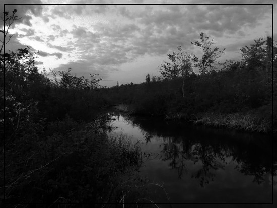
So pleased with this as not confident with street photography and I liked the framing and bit of contrast
I liked how this one turned out
@hvansteenburgh @homeschoolmom @tibles @annied @30pics4jackiesdiamond @meowtographer @salza @mandygravil
Thank you Heather, Lisa, Riikka. Annie, Jackie, Meowtographer, Sally, and Mandy! Beautiful and striking contributions!
it took all day for me to come up with this. i tried umpteen ways with different fruits/lights/reflectors etc. you name it and i most likely tried it. in the end i liked what i produced.
without this theme it would not have been done, thank you very much for making it possible.