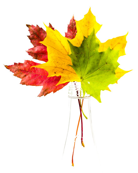
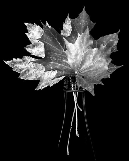
i've been on 365 for almost 3 years now, and very early on discovered my home in black and white... over my time here, i have remained endlessly fascinated by the tension of colour vs. b&w... not that i think one is better than another - just that people clearly respond differently to them, and it seems to me that most people are more likely to connect with colour than black and white...
yesterday i posted two versions of the same shot... one in colour (BECAUSE.I.WAS.PUSHED ;p) and the other in black and white... i think artistically (for lack of a better word), the image works equally well in either format... however, 100% i prefer the black and white version... i can't articulate why and i wish i could...
anyway, i've been meaning to start a thread on this topic for ages, and i thought these images make a good starting point... so... on the whole and in general (i.e.: not necessarily related to these specific images), do you prefer black and white or do you prefer colour? and why do you think that is?
(just to be clear - i'm not asking which of the shots below you prefer... i'm just posting them here to help with thinking about the b&w vs. colour thing)
B and w. Though I've not done much personally for a while. All the favourite works I see on here and further afield are b and w. It just gets to me emotionally more. I don't know why. I'm exploring so much at the moment but I know my heart in the long term will be found in b and w. Why? I am yet to fully understand. But I know my heart beats faster and harder for stunning images in b and w and at some point my best photography will be that of technical knowledge but more importantly I think heart and emotion whatever the subject.
I am always torn and go through phases in either. I love the timeless elements or moods that can be created with b&w but I also find playing with colour tones fascinating. I still lean towards dark either way with the very occasional high key and pastels... A lot of rambling for no answer really 😄
@northy I honestly cannot tell you which one I prefer, as they both speak to me differently - the colour one is just breathtakingly beautiful- so colourful against that white background, and the black and white is striking! So, well done on BOTH!
I usually have a slight preference for color. But there are times where black and white is better or brings out something really different in a photo. Your examples are great. The color one is beautiful and eye-catching - gorgeous colors and they really pop off the white background. Emotionally it makes me smile and feel happy. The black and white one shows more of the leaf texture and I find I spend more time exploring the image and looking at the details in that one. Emotionally it brings a seriousness or a contemplative mood. The choice of b&w or color may relate to how you want the photo to affect people...?
I can usually see the B&W translation in my head before trying it but there have been times that the colour just wasn't working and I couldn't find a way to fix it. That's when I try B&W before giving up and deleting it. Very often it's the colour contrasts that aren't working, latest one is the sepia photo on my page, like when the sky and water are blue but the other elements aren't complimentary tones. (You know those edits when something just isn't right and you can't for the life of you figure what it is) It's always my practice and advice to people to try the B&W or a different toned treatment before giving up on an otherwise good shot.
I'm drawn to colour, but when I see a well done shot in B+W, I find myself looking at the image for longer, as if more details appear to me. I've often wondered if the photographer saw the image in B+W before it was shot, or after, and think, "why didn't I think of that!"
First, love your photos you post here in the thread. I've been on this fall thing of trying out unusual fall shots. Because of that, I feel that I like the black and white here better, because of it being a DIFFERENT view. However, I would not have that context if it wasn't for the color reference.
I think it isn't about whether a scene is better in COLOR or BW. It's about the emotion you are trying to convey, and the SCENE itself. Some shots are just going to work better in black and white - like a scene that has garishly ugly colors that clash, black and white makes it work. Contrasty shots look better in black and white (case above - LOTS of contrast on your shot in color).
However, if the subject is COLOR like a skyscape or sunset, then why would you shoot it in black and white???? It might look different, or even better in black and white, but if your subject is color....
So, it depends on each shot.
To be honest, most people convert to black and white to create an atmosphere or to try to increase the "art" to it when the art is otherwise lacking. This is often the case with street photos I think. You convert a poor subject to black and white, add some grain, and a vignette, and boost the levels.... and still it is just a picture of a pigeon eating something off the street.
So, I am rambling. But my point is that converting to black and white shouldn't be about if it "looks better". Rather, the decision should be made before the shot is taken about what kind of shot it will be. And sometimes after the shot is taken, a conversion does make it better in BW, nothing wrong with that.
As with all things in photography, it isn't about the perfect shot by the book. It's about creating the feeling, emotion, connection, unique quality in an image. That should be the goal.
@adambralston tx Adam... you raise some good points there... when i think about what i shoot, it's generally more about the light and shadow and space than the thing i'm using as a subject... and indeed, i generally think before hand whether i would be processing in black and white or in colour... and i generally think black and white as a default... which is my point.... it seems to me most think colour first, and only switch to black and white as an afterthought...
if you look on the popular or trending pages, you'll see that most photos are in colour... but then, most photos are pictures of tangible "things"... and most things, of course, are in colour :)
i disagree though about street shots... i think the point of street shots is to capture a moment... the streets, however, are often chaotically full of clashing colour (;p!!) and as the photographer has limited control over the scene, often processing in black and white will assist in de-emphasizing distracting elements and focussing the eye on the main subject...
I love them both equally, for different reasons. This photo just screams color because the nature of the subject, but the b&w is so intriguing and artistic.
@northy Absolutely. Your shots blow me away. Can't say enough about that. After I posted, I thought about it a little more. I think I definitely see in color vs. BW. And I have heard that argument for or against color/BW disparity often. Maybe it really is just about the way you see the world. Kind of like being a nature, street, or portrait photographer for example. You shoot what you see. You know, let me ramble for two more seconds or so here. I have another example. It's like a painting class. 20 students are looking at a table, with a nude standing on it. Every painting will be different - use different colors, different shades, different angles, but all are seeing the same subject.
Photography, of course, we are all looking at the same tangible object, but we don't all "See" it the same either right? I mean, the camera does. The camera takes the image, the photographer creates the image right? So, I really think it is perhaps something inherent in the photographer. If somebody sees black and white well (like you) they benefit from it. And if there are fewer of those shots, it makes you more unique and special for it right?
But, I think we are visual beings. Attracted to light mostly, just like insects :) And, we are attracted to color. Something goes through our eye, hits the fundus in the back of the eye, converts to electrical signals, and those signals stimulate the brain in ways that black and white may not? *blah blah blah* :) I like to ramble.
About street: I actually agree with you. I hadn't thought about those converting to black and white in order to control the garish colors, etc. as I stated as well to de-emphasize distracting elements. I agree there. But, I think some people do convert their images to black and white trying to create atmosphere because there isn't much there in the photo to begin with. Hey, I've done that for sure. It's another form of ETSOOI right? I think that is when the art comes into play.
Great thoughts Northy. Love to hear them and to discuss photography in general. I know I can definitely learn a lot from you.
I admire b&w photography, there something so compelling about it. But in my own work and art, I'm drawn to color...vibrant color. In the roughly 400 photographs that I keep in my portfolio, only about six are black and white. And in those instances, I converted the photos to b&w because there was something distracting about the color -- and turning it to black and white eliminated the distraction, and focused the image on what was important.
It really has to do with WHAT is in the image for me. If there is compositional value in color, then color is fine. But while people think about rules of composition in terms of things like "rule of thirds" or "leading lines" or "repeating patterns" or "textures" and such, when it comes to color, almost no thought is given to "rules" of color. Placement of the "primaries" with respect to the color wheel being the main one, and how color placement can surely pull the eye as strongly as can leading lines and repeating patterns. Some people above talk about "distracting" color, and that usually occurs when no thought is given to "what" colors are in the image, and they "clash" or pull the eye to discordant elements, away from finer, sometimes hiding, often overwhelmed, detail.
As @adambralston remarks, B&W can seemingly "add" something to many images that might at first appear like "nothing there" in color. But what that usually means is that existing color is "distracting from" and "overwhelming" the detail, often unexpected detail, swamping it with so much extraneous, unimportant stimulus, that we lose interest in looking beyond or color perception "high level" or "finer" points that are lurking. The image just reduced to tone (lightness/darkness) removes the unimportant, the distraction, the "ordinary" even, and more easily points us to the real point or detail of the image.
Another way of thinking about it is that it is natural selection that has caused us to "see" in color, at least the majority of us, and we get lazy when presented with a color frame, often not doing the work it takes to extract, apart from the color itself, what might be lurking there. Color perception is just how natural selection has encoded the differences in certain basic survival situations so we don't have to think or exert ourselves too much; our job of survival on the African plains was made a little simpler. "Red" is hot and dangerous, "blue" is cool, "green" is (usually) good to eat. Ever wondered why RGB are the three elements of human color processing elements in the eye? OK, enough of the evolutionary biology sidetrack.
There's a lot of interesting discussion about the power of B&W to pull us up, make us purposely look and purposely search for "detail" and "meaning," not to rely on our "instinct" for color perception, in the truly excellent book "The Complete Guide to Black & White Digital Photography" by Michael Freeman. Along with at least three more gems of wisdom on every page of its 200+ pages. In a nutshell, it's not "natural" and that's its basic power, a new layer of abstraction that we actually have to think about, consciously or unconsciously. Much of the history of photography has actually pulled our evolutionary development down a new path, away from primordial color to "higher level" B&W. Freeman talks about that to in his sections "Black & White as Normality."
Not to say color is not good, and cool, it certainly can be. But B&W in photography and the graphic arts in general is on a higher plane of abstraction from (natural) color and makes us do a lot more high level processing of the material we are presented with, and not to rely on our primordial, and yes even natural, perception.
Boy, I didn't mean to get so deep into this, but there you have it...
Not to over simplify - but when I see a color image it feels real to me - it is a scene or an image that I could share seeing with the photographer if I was standing there, at the same time. The black and white images are obviously an art form - a photograph. Like looking at a painting - it is passed through that persons vision in a unique way that becomes something else. I am not that deep a thinker - my insight stops there.
I would choose colour 95% of the time. It's how I see my world. I do love a good B&W high contrast portrait though, especially for its ability to bring out detail. Im big on primary colours. Deep blue skies, pops of red and vibrant yellows really stimulate my visual senses. I struggle to evaluate what makes a good B&W image as I can't see it in my mind beforehand. I only ever do post processing in B&W out of curiosity more than anything.
When an image is in color, your audience sees the colors first. When it is in black and white, they see the image. This makes sense in light of one of my favorite photography quotes (by Ted Grant): “When you photograph people in color, you photograph their clothes. But when you photograph people in Black and white, you photograph their souls!” I feel this quote has many applications.
For me it depends on the subject, some images just work better in black and white but you also can't go past a gorgeous sunrise or sunset when the light and colour are so perfect.
@northy
Hi! Great conversation thread
I often think about this. There is something about black and white that draws me in that I almost can't put into words... more than just an 'arty' expression. Sometimes when i look at my subject i can just 'see' it more in B&W than colour.... other times I might salvage an image by converting it! But then there are times when nothing but colour will do.
As a rule I like street photography in B&W because it tends to be about the narrative surrounding the subject. But then if i think of the wonderful Bill Cunningham - his amazing fashion street photography would never work in B&W!! (unless perhaps there was an Audrey Hepburn-esk image!)
thanks everyone... this has given me quite a bit to think about... i wonder how much of what i do is really photography, and how much is just an attempt at conceptual art of some sort... it occurs to me that i rarely take pictures of things... mostly i play with light... oh, i do take pictures when i am on vacation, and i generally keep those in full colour - but then, for those pictures, i am usually trying to capture something to remember the vacation, or to communicate the vacation to others...
it's not that i don't see colours... i do... but i naturally gravitate to black and white or more muted tones in just about everything (had a helluva time trying to find something to wear to an afternoon outdoor wedding last summer... no white, of course... and was also told no black... and my neutrals were too close to white... a friend suggested i should wear a cute floral summer dress... what the heck???????????? but i digress ;p)
anyway, the fact is, i am drawn to black and white and i think it's more about art than photography, and that's pretty much that!
@frankhymus well... photography is an art form for sure... but somewhere i was reading about someone who described himself as an artist, who used the medium of photography... or something like that... anyway, at some level it seems to me there is a divide between the photographers who do a wonderful job of capturing what everyone sees more or less the same way, and those who do conceptual photography in an attempt to illustrate an idea rather than show a thing... and i think i am talking the most abysmal rubbish, so i shall stop now ;p
I am strange... I do not do much b and w.. But I seem to prefer it. And when I do start to use b and w, then I want everything to be b and w. Even if my hubby is saying how it looks better in color.
I fell in love with B&W photography first through darkroom play. Now the majority of my photos are colour, though when colour isn't adding anything, I'll often go B&W or to emphasize lines or silhouette's, simplify a 'noisy' picture, or create a certain mood. I do think there is something more arty about B&W as it shifts how we see the world.
I wonder, if your distinction between realism and the conceptual isn't a bit overstated? What about photography which is used as social commentary? Here you might want to isolate something very "real" to call attention to it. And to do so you might well want to use B&W as part of the process of isolating your subject from its surroundings. Similarly in portraiture, you might find B&W helps isolate a character trait or emotion in your subject. The result might well deserve to be called artistic. But it wouldn't necessarily be conceptual. And conversely, surely you can do conceptual art in (with) colour?
I do like b&w but very rarely do I achieve any good b&w shots. I particularly like nature shots because instead of focusing too much on the colour your eye is really drawn to the details and textures.
I love both photos, but the black and white is just awesome. I think I agree with some of the comments above...when in color, you notice the color; when in B/W you notice the subject. I don't do a lot of B/W, but I am always drawn to them too.
@jasperc hmmm... i don't think i was drawing the distinction between colour/realism vs. b&w/conceptual... more that my preference for b&w is drawn from a more conceptual approach to photography with a focus on light rather than colour... doesn't mean i don't think you can't use b&w for realism, or that you can't use colour for conceptual... i have done tons of street photography, mostly b&w... i would love to go back to doing more, but don't have the opportunities for doing so that i had before switching jobs in the spring...

And look at how much it completely changes the mood by taking out the color:
I think black and white tends to make a more emotional image.
I think it isn't about whether a scene is better in COLOR or BW. It's about the emotion you are trying to convey, and the SCENE itself. Some shots are just going to work better in black and white - like a scene that has garishly ugly colors that clash, black and white makes it work. Contrasty shots look better in black and white (case above - LOTS of contrast on your shot in color).
However, if the subject is COLOR like a skyscape or sunset, then why would you shoot it in black and white???? It might look different, or even better in black and white, but if your subject is color....
So, it depends on each shot.
To be honest, most people convert to black and white to create an atmosphere or to try to increase the "art" to it when the art is otherwise lacking. This is often the case with street photos I think. You convert a poor subject to black and white, add some grain, and a vignette, and boost the levels.... and still it is just a picture of a pigeon eating something off the street.
So, I am rambling. But my point is that converting to black and white shouldn't be about if it "looks better". Rather, the decision should be made before the shot is taken about what kind of shot it will be. And sometimes after the shot is taken, a conversion does make it better in BW, nothing wrong with that.
As with all things in photography, it isn't about the perfect shot by the book. It's about creating the feeling, emotion, connection, unique quality in an image. That should be the goal.
if you look on the popular or trending pages, you'll see that most photos are in colour... but then, most photos are pictures of tangible "things"... and most things, of course, are in colour :)
i disagree though about street shots... i think the point of street shots is to capture a moment... the streets, however, are often chaotically full of clashing colour (;p!!) and as the photographer has limited control over the scene, often processing in black and white will assist in de-emphasizing distracting elements and focussing the eye on the main subject...
Photography, of course, we are all looking at the same tangible object, but we don't all "See" it the same either right? I mean, the camera does. The camera takes the image, the photographer creates the image right? So, I really think it is perhaps something inherent in the photographer. If somebody sees black and white well (like you) they benefit from it. And if there are fewer of those shots, it makes you more unique and special for it right?
But, I think we are visual beings. Attracted to light mostly, just like insects :) And, we are attracted to color. Something goes through our eye, hits the fundus in the back of the eye, converts to electrical signals, and those signals stimulate the brain in ways that black and white may not? *blah blah blah* :) I like to ramble.
About street: I actually agree with you. I hadn't thought about those converting to black and white in order to control the garish colors, etc. as I stated as well to de-emphasize distracting elements. I agree there. But, I think some people do convert their images to black and white trying to create atmosphere because there isn't much there in the photo to begin with. Hey, I've done that for sure. It's another form of ETSOOI right? I think that is when the art comes into play.
Great thoughts Northy. Love to hear them and to discuss photography in general. I know I can definitely learn a lot from you.
As @adambralston remarks, B&W can seemingly "add" something to many images that might at first appear like "nothing there" in color. But what that usually means is that existing color is "distracting from" and "overwhelming" the detail, often unexpected detail, swamping it with so much extraneous, unimportant stimulus, that we lose interest in looking beyond or color perception "high level" or "finer" points that are lurking. The image just reduced to tone (lightness/darkness) removes the unimportant, the distraction, the "ordinary" even, and more easily points us to the real point or detail of the image.
Another way of thinking about it is that it is natural selection that has caused us to "see" in color, at least the majority of us, and we get lazy when presented with a color frame, often not doing the work it takes to extract, apart from the color itself, what might be lurking there. Color perception is just how natural selection has encoded the differences in certain basic survival situations so we don't have to think or exert ourselves too much; our job of survival on the African plains was made a little simpler. "Red" is hot and dangerous, "blue" is cool, "green" is (usually) good to eat. Ever wondered why RGB are the three elements of human color processing elements in the eye? OK, enough of the evolutionary biology sidetrack.
There's a lot of interesting discussion about the power of B&W to pull us up, make us purposely look and purposely search for "detail" and "meaning," not to rely on our "instinct" for color perception, in the truly excellent book "The Complete Guide to Black & White Digital Photography" by Michael Freeman. Along with at least three more gems of wisdom on every page of its 200+ pages. In a nutshell, it's not "natural" and that's its basic power, a new layer of abstraction that we actually have to think about, consciously or unconsciously. Much of the history of photography has actually pulled our evolutionary development down a new path, away from primordial color to "higher level" B&W. Freeman talks about that to in his sections "Black & White as Normality."
Not to say color is not good, and cool, it certainly can be. But B&W in photography and the graphic arts in general is on a higher plane of abstraction from (natural) color and makes us do a lot more high level processing of the material we are presented with, and not to rely on our primordial, and yes even natural, perception.
Boy, I didn't mean to get so deep into this, but there you have it...
In general, I would only do B&W for portraits
Hi! Great conversation thread
I often think about this. There is something about black and white that draws me in that I almost can't put into words... more than just an 'arty' expression. Sometimes when i look at my subject i can just 'see' it more in B&W than colour.... other times I might salvage an image by converting it! But then there are times when nothing but colour will do.
As a rule I like street photography in B&W because it tends to be about the narrative surrounding the subject. But then if i think of the wonderful Bill Cunningham - his amazing fashion street photography would never work in B&W!! (unless perhaps there was an Audrey Hepburn-esk image!)
it's not that i don't see colours... i do... but i naturally gravitate to black and white or more muted tones in just about everything (had a helluva time trying to find something to wear to an afternoon outdoor wedding last summer... no white, of course... and was also told no black... and my neutrals were too close to white... a friend suggested i should wear a cute floral summer dress... what the heck???????????? but i digress ;p)
anyway, the fact is, i am drawn to black and white and i think it's more about art than photography, and that's pretty much that!
@homeschoolmom @brigette @nicolecampbell @axika @wetsilver @teodw @remirixjones @mwbc @frankhymus @chackmann @kjarn @donnareadvisions @featherstone @tina_mac @froggie0628 @ksmale @megstorey @lynnilou @newbank @creampuff @ksmale @donnareadvisions @timandelke @roseolivia
great thread and great images.
I wonder, if your distinction between realism and the conceptual isn't a bit overstated? What about photography which is used as social commentary? Here you might want to isolate something very "real" to call attention to it. And to do so you might well want to use B&W as part of the process of isolating your subject from its surroundings. Similarly in portraiture, you might find B&W helps isolate a character trait or emotion in your subject. The result might well deserve to be called artistic. But it wouldn't necessarily be conceptual. And conversely, surely you can do conceptual art in (with) colour?