Do some of the camera settings intimidate you? Do you want to learn how to develop your photography skills and learn how to use your camera effectively without always going back to the “auto” function? These challenges are for you!
These are designed for those experienced photographers to share their knowledge with others who are anxious to learn and improve their skills. This fortnight's challenge is ... White Balance
Before we get started:
White balance is often a matter of taste and sometimes controversy. In this challenge we are covering the basics but as with all the previous challenges we could get very technical but for now we start as an intro and encourage you to dig deeper on your own as you choose. I have added some additional links to dig even further but there is a lot of info available.
Most cameras will allow you set the white balance (even most point-n-shoots). In the past I paid very close attention to white balance but now that I shoot raw images (not jpegs) and I have the Adobe Lightroom software I rarely think about it and I make the majority of my white balance adjustments in post processing. So my recommendation is if you are able to use Lightroom and you want to have professional looking images make the investment. And when you do shoot raw.
What is white balance?
“White balance (WB) is the process of removing unrealistic color casts, so that objects which appear white in person are rendered white in your photo. Proper camera white balance has to take into account the "color temperature" of a light source, which refers to the relative warmth or coolness of white light. Our eyes are very good at judging what is white under different light sources, but digital cameras often have great difficulty with auto white balance (AWB) — and can create unsightly blue, orange, or even green color casts. Understanding digital white balance can help you avoid these color casts, thereby improving your photos under a wider range of lighting conditions.” Cambridege incolour.com
Here is the entire article the above definition was copied from:
http://www.cambridgeincolour.com/tutorials/white-balance.htm
Other articles and links:
Below in the comments are links that you are able to click on. For some reason the links do not work in this thread.
Here is an article by Ross Scrivener on Jun 14th 2010
http://365project.org/blog/how-to-use-white-balance-effectively
And our previous Camera Settings Challenge introducing the topic of white balance.
http://365project.org/discuss/themes-competitions/13555/csc-9-white-balance
Photo Examples and some white balance setting options:
Here are some photo examples of the effects of white balance on your photo:
Types of white balance settings:
Choose some of the various settings that are used in various lighting conditions and cast cooler or warmer tones.
Auto: Good if your not sure what to use or don't have time to make the necessary changes. It works well in sunlight, but in many situations it’s not suitable. If you shoot in camera raw verses jpeg and you are able to make the adjustment in post processing software such as Lightroom this setting works fine.
Daylight: Auto mode can been good in daylight, but not perfect. I would typically use this balance in daylight, but most people tend to stick to auto because they’re worried about forgetting to change the WB when they go back indoors.
Shade: Auto mode makes photos look a little cold in the shade so using this preset will be a lot more accurate.
Cloudy: Again, this is pretty self explanatory as to when you’d use it.
Tungsten: This light comes from incandescent bulbs found in your home and if left on auto your photos will come out very warm with an almost orange color cast.
Fluorescent: This comes from tube lighting found in offices and hospitals. It’s a very cold light and can make your photos appear blue. This is also why offices have that nasty sterile feel.
Flash: This compensates for the somewhat cool light of the camera’s flash.\
Custom: This is used for setting the white balance accurately using a grey card –
Using a grey card:
If you want a more accurate reading use a grey card to set your white balance.
This is done by selecting your customized white balance setting and then taking a photo of the neutral grey card. Your camera will obtain the data and usually the photo will have much more accurate colors. Finding proper white balance is really about the camera being able to determine what is the neutral grey in an image and the colors and color casts are adjusted accordingly.
Time to Practice AND post your image in this thread:
Practice taking photos outdoors using the various white balance settings. What did you notice?
Try to take a photo and match the actual “true” colors you see with your eyes using various white balance settings.
** If you have a grey card get readings using the custom white balance setting in your camera .Grey cards are very inexpensive to purchase. ** Post a before and after shot in this thread.
Post several photos using the same scene but using various white balance options. Please let us know what settings you used. Did you learn anything? Let us know. HINT – if you would like you can select dates prior to starting your 365 project and post photos on that page.
Try taking some photos indoors using different white balance settings. What did you notice? If you are able to take a photo using a grey card compare the results to other white balance settings.
The new camera settings challenge has started. Even if you are not practicing at this time let us know your interest. We want to know if this information is helpful. Thank you!
This is really nicely explained; thank you! I am working on histogram usage at the moment, but I really want to explore this topic soon. Will try to post something if I get a chance!
I change my WB often but I've often thought about trying the grey card thing and never gotten around to it. Maybe time to try it and see how my camera works with it.
Thanks for the info as always, so please keep me in the tag list.
Here are my outdoor shots. All shot in RAW, with no adjustments. I learned that I can't trust my eyes for true colors when working in LR, because I have distinct color preferences and I can't convince my brain of what is true!
Indoor shots. I tend to like warm colors indoors. I've been in the habit of leaving my camera on Auto WB, shooting raw, and correcting in LR. Sometimes I leave the WB on As Shot if I like the colors. I learned that's not the best technique because of my strong color preferences.
@dmcoile Hi Dianna. I think it is perfectly good technique to shoot raw with Auto WB and correct in LR PS/ACR to your own taste. Who is to say that the camera can work out what is "true" from its presets any better than your post-processing eye?
Some cameras do have several Auto WB options, usually one will serve to keep it on the "warm" side. When you take it into LR it will depend on what your LR defaults are, but if you haven't changed much, the WB will be "as shot." And some cameras have many slots (some cameras up to 10 or 12) for you to define your own custom WBs, up to and including the Magenta/Green tint content as well as the Blue/Yellow temperature content. But unless you are shooting jpeg, I would ask "Why bother? See to it in your raw converter/processor."
BTW, it's a mistake to think that when you take a raw into LR, it is initially SOOC. Again it will depend on what your Camera Profile is set to. By default it is initially processed as "Adobe Standard" which is not any of the picture controls from your camera, and is not even the jpeg thumbnail that is stored in the raw file by the camera. The WB will be "as shot" as I said, but that's about it. You can change this in Camera Calibration | Camera Pofile. With my Nikon, LR/ACR knows about the "standard" Nikon controls, and I have set my default to Camera Standard. Adobe Standard is quite blah, and is the origin of the comments often heard that "The Raw file looks so bland. What's the problem?" You can, of course, even define your own default processing based on all or part of a previous ACR/LR session, and many folks do just that
@frankhymus Thank you so much for this information! I have been using Camera Calibration recently as a result of a video I had found on processing landscapes. I didn't know I could change my defaults there. I should have realized that these settings affect what I've called SOOC.
I'm using a Canon 6D and as far as I can tell, I can only store one custom WB at a time. I need to research that some more as I know there are other picture controls that I haven't explored.
I probably will continue to use AWB, as I always shoot raw and never post anything without at least basic adjustments in LR. I was just surprised at how far off my own perception can be from what is "true" and I suspect if I were ever processing for a client, that could be an issue.
@dianen In my opinion the closer to shooting your image the way you want your final outcome always saves editing time, especially if you have a lot to edit. But since I have Lightroom I like to shoot raw and I pay less attention to WB now than previously when I shot in jpeg. If you soot raw and have a software such as LR then for me if I am somewhat close that is good enough.If the white balance is obviously off I adjust it pre-edit.
@frankhymus@dmcoile I really have to mirror what Frank said. The final results is going to be a matter of your own artistic taste. I personally like it slightly on the warmer side - I like the overall feel of the image. Sometimes our eyes and brain adjusts what we see. Our personal lens (our eyes & brain) is amazing. There was a time (and I see it frequently from other photographers even on this site) that I didn't even recognize the color cast. Even though you plan to continue to use AWB, shoot raw and adjust in LR it is still a good exercise to see what is realistic It is better imo, to have a color cast on a photo because it was the photographers preference rather than because they never knew it existed. .
@myhrhelper Thanks, Kathy. I do feel free to adjust colors to my preference for my own use, but it has been an eye opener (pun intended) to recognize the color cast or lack thereof, and compare my processed colors to the actual.
Thanks again. I really appreciate this discussion.
@dianen Just to add to what Kathy said, the "as shot" white balance (the color temperature and the color tint) is stored as "meta data" in the raw file but matters not at all as to what digital data is captured in that file. The only "color" that is recorded is that determined by the Breyer Filter Array and the smart color computations that are closely guarded intellectual property secrets of the camera's manufacturer.
What is shown initially in your raw processor after loading is determined by the processor's default settings, and that often includes the "as shot" white balance computation. But not always. You can see more of this discussion when I responded to Dianna above.
JPEG, of course is a different matter, because of the final, in-camera JPEG processing which will include the "as shot" WB.
Thanks @frankhymus And @myhrhelper for answering that question. I am usually on top of white balance. I love these challenges. I don't always participate because some of them (like this one) I feel quite comfortable with the settings and using them. And life gets busy and i dont always have the time But I always read thru the comments and instructions. Keep them coming!
@dmcoile You mentioned "processing for clients", I'd like to chip in a thought on that topic as I have experience in that regard. I've found that my clients aren't particular too much about how "perfect" the white balance is as long as it is fairly 'relative to their memory' of the occasion. Actually, they usually do prefer it just ever so slightly warmer than it actually was. What they DO notice though, is the consistency of white balance through the shoot, and more specifically, a particular sequence of images. Varying white balance when perusing through a sequence of images shot in the same lighting conditions/location sticks out like a sore thumb. One of my friends gave me their daughters graduation invitation for which the front was a collage of her senior photos and I had to bite my tongue before saying out loud they should get a refund from their photographer. Four of the five portraits matched white balance perfectly, the fifth photo was about 1000 degrees cooler...and in the context of the collage it looked downright horrid...like she was about to faint. I'm actually a little surprised they used it in the collage. The cooler portrait probably looked fine when it was the only photo on the screen, but in the collage on the invitation, oh dear me!
So at a photo session (i.e., any time you know you will be shooting a good quantity of images in the same lighting conditions...e.g., a particular room/yard/etc) is a good place to use a custom white balance or a specific temperature setting so that right off the bat all your photos are consistent out of the gate. Although you will likely fine tune the white balance anyway in post, having them all consistent at the start really helps the sanity.
@dbj Thank you! This is so timely! I just did a shoot for my next door neighbor of her German Shepherd puppies. She's a breeder and has seven adorable pups. She needed some shots for ads. In post, i looked at groups of photos shot in the same location and in the same direction, adjusted the white balance and exposure, then synced them in LR. The pups were running in a herd (crazy cute!) and when I changed my direction or location, I adjusted the WB again if the exposure looked different. I used the same "Daylight" preset throughout, but tweaked it a bit if necessary. I don't know that I would have thought about it this way prior to this discussion.
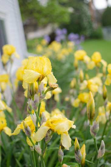
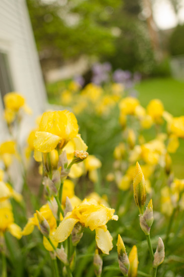
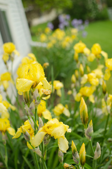
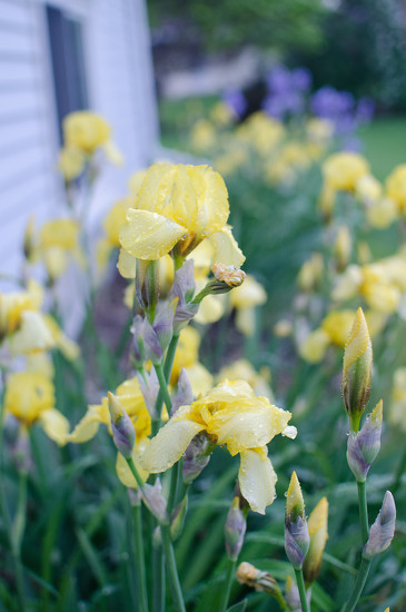
OK, so I kind of like the Auto white balance setting in this series (the bottom left) but since the White Fluorescent and Custom/gray card images are nearly identical, I'm guessing they're really more accurate!
@dbj@dmcoile Excellent point - white balance is often a matter of taste but consistency is important. Generally speaking even in photography rules can be broken and there is some freedom of artistic expression but when photographing for a client it is important that they share the same artistic taste as we do. If some photos are a slight blue cast others yellow they may not know why they don't like what they see but it will come across less professional especially when shooting an event.
@sarahsthreads Great collage - again it really is about what you like as the photographer. Sometimes what looks the closest to reality may not be what you want in the end. I typically like a more of a warmer look as well. I think I personally would prefer to start with the image bottom right and warm it up slightly. The auto seems to have a little bit of a green cast to me. Of course I also have to remember each person's computer isn't always calibrated the same so what I see on my computer may be different than someone else. To me the custom version has a softer bokeh background than the florescent but that is also just a matter of personal taste. Also viewing from a collage is difficult since the images are so small.
@myhrhelper Now that I'm looking at it with less tired eyes, I agree the Auto has a greenish cast.
The difference in background is entirely because I didn't have my tripod with me at work last night (where I took these) and so the angle is just ever so slightly different since I had to shoot the gray card and set the custom white balance and then try to find the same point to take the last photo. Should have done that one first!
I edited the custom shot in Lightroom and added +15 to the temp (I should probably start shooting in RAW and figure out how that all works so I can actually see the color temperature!) At least on my monitor this is far more pleasant than any of the in-camera settings or the original custom shot.
Replying to the original post, above, I am very interested in these challenges. Even if I don't have time to concentrate on the particular challenge at the moment, I learn a great deal from reading the introductory notes, questions and answers. Very, very helpful - please keep me on the list. :)
@sarahsthreads I like this one, especially viewed large. With Collages it is difficult since the images are always so small but they work nice as a comparison. Personally I shoot raw all the time and edit in Lightroom. If you have the time to do a grey card check it is helpful but when moving from one spot to another everything changes. The examples I used above were quick shots and I did not use a tripod either so they were all slightly different but shot from the same direction and same camera settings. I think the main thing is to understand and recognize the different effects on the image and once you are aware you then decide what you what to achieve in the image. Before I learned about white balance I didn't even realize my photos were too yellow or blue. But now I've intentionally used the wrong setting for an artistic effect. But most of the time it is simply adjusting in Lightroom.
I was having a real dilemma on the white balance for this. I felt the As Shot was slightly too blue, emphasising the fencing in the front of the shot. Cloudy - which the day actually was is just way to yellow and daylight is not much better. The final is my personal setting. I think it does the best job of not drawing eyes to the fencing and I like the colouring to the leopard. Would really appreciate comments on your favourite :)
@pixiemac Were these camera settings or post processing settings?
It really is a matter of personal taste. To me the first and last are the best I don't like the yellow and green cast on the cloudy or daylight version. It is hard to tell with a collage since the images are so small. All of them have a lot of green not sure if that is because the wood had a lot of green but then I wonder about the stone to the right. I would take either the custom or as shot and then adjust further to your taste in post processing.
Really a fantastic example Sarah of the different effects these settings have on the image.
@myhrhelper Kathy, these were RAW files, then changing the white balance in Lightroom. Would probably have been a better test if I had shot jpg at the venue, but this sprang to mind when I was trying to process this as a suitable candidate for the challenge.
The wood was very green and the stone, is actually a very significant wooden post :)
Thanks for your input Kathy, really appreciated, I am going to play a little more with this.
@pixiemac This specific challenge is for changing the settings in the camera prior to post edit. I thought it sounded like Ligthtroom since they have the "as shot" option.
I think if you are going to adjust the image's white balance in post production it is best to shoot raw not jpeg. I am biased toward shooting raw.
Finally had nice weather and a chance to get out and complete the challenge. All shots were RAW imported into LR and exported without edit to PS to create the montage (i.e., these are SOOC). Exif data: ISO 100, f/11, 1/200 sec, 18mm.
The Grevillea Flowers were covered in bees today. These photos were shot at around 4.30pm so there was no sun & it is winter (almost).
AWB & Daylight (left & middle shots respectively) were the best shots, with Daylight being a bit closer to the 'real' thing. Cloudy & Shade were too yellow. Tungsten (right shot) had a blue tinge, while Fluorescent went White.
I feel you could have a lot of fun with effects using WB settings, I can picture an old run down house in a secluded spot being photographed with Tungsten to make it eerie & spooky.
@cdean1956 Hi Charles, I like how you made your montage. How did you do it? I only have Photoshop Elements, can it be done in that? I like the Daylight one the best.
@cdean1956 Great creative collage to demonstrate how the different white balance settings will have a dramatic effect on the photo. I like the look of daylight but it is difficult to fully assess with such a narrow area. Thank you for sharing - very helpful
I love these challenges and all the information you provide. I always read them even if I don't have time to actually post a photo of my trials. I would appreciate being added to the list so that I don't have to keep looking for them. Thanks
@jennymallett Nice observations about using an "odd" WB creatively. A real cool (easy) project is to take something like a graveyard, a dome even, in normal light (so you don't have to go out in the night time) but shoot (or process) it to make it look like the deep blue of night. Underexpose 3 stops (more or less) and pull the white balance way over to the left (tungsten would do at a pinch) to add the deep dark blue tones of night.
Pardon her changing expressions (she went from thinking she heard the bus to relaxing because she had a few more moments to being sure she heard the bus and panicking in the space of four quick photos.)
I can see a slight difference between Auto (top left) and Shade (bottom right) but I like both. Daylight (top right) is too cool and Cloudy (bottom left) is too yellow-green. These were taken under a shady tree with the sun still behind the house (which was in turn behind me.)
@sarahsthreads Great experiment - Your daughter is adorable!!
I agree with you on the colors the daylight is a little too cold and the cloudy is just a little too yellow for my taste. To me it is a fine line between having a warm feel to looking jaundice. For my taste the auto looks a little too cold as well and I like the shade version the best in this case. Interesting because the photo was taken in the shade as well.
Left - As Shot
Middle - Daylight
Right - Cloudy
Shot in RAW and white balance was adjusted in Lightroom. This was something I have not done before so was interesting to know I could adjust there.
I usually leave the white balance on Auto and shoot in jpeg.
I often forget to check the white balance in the camera settings and if I do change it, forget to change it back and wonder why my photos have a funny tinge to them :)
I think I prefer the daylight setting in this shot.
@frankhymus@myhrhelper Hi Kathy & Frank, thanks for your comments. I am going to go to try the Graveyard Shot next weekend Frank, I will let you know how I go.
@adayinmallacoota If you shoot in raw you have more options if you have Lightroom. In Lightroom there are actually other ways to adjust the white balance as well such as using the dropper and finding a "grey" portion of the photo or black or white if there is no grey works sometimes. Thank you for showing this collage.
This exercise really made me wonder about the default "cloudy" (top picture) where I've habitually had the camera set. The middle one is auto and the bottom is set for full sun even though I was in the shaded woods. I also discovered that auto white balance often works quite well indoors (though not necessarily outside). I think I will be trying out a grey card soon.
@francoise "Cloudy" conditions have a lot of natural blue light in them, the clouds scatter the blue wavelengths even more than just the atmosphere does. So the camera Cloudy WB compensates/corrects by adding a lot of yellow. When applied to conditions where the natural light is not so blue it will end up with too much yellow applied. At least for a "natural" look.
I'm posting this as a little "extension" to some of the considerations you've seen here already, and that concerns the issue of "mixed" white balances, two different light sources in the same frame, with distinctly different color for their reflected light.
If you are interested, click on the image to go to my 365 album to read about some of the issues, and some of the "artistic" effects you can try for. Your eyes (and the brain behind it) are so very clever, "knowing" what is going on and even self-correcting" of both without you even being aware of it. A digital camera, however, is much more pedestrian, just registering the color "unadjusted" by any image processor or at most processing both the same way.
@frankhymus thanks for posting that - I wanted to add some information on mixed white balance and never did so that is awesome.
Perhaps with your ok with it - I may add this info in the main thread as well! :) - or you could add it if you would like
@jennymallett Ah, that is very clever! A great way to use white balance to your avantge - would never guess it was during the day time.
Thank you for sharing!
Write a Reply
Sign up for a free account or Sign in to post a comment.


@acsstudios @adayinmallacoota @aecasey @aliha @alinz @alisonp @andrina @aponi@aquaina @autumneden2015 @barb_b @barbtatum @barneyone @berta @billy52@bizziebeeme @blinkny @brigette @brittwd @bsheppard @callymazoo @candysiegmueller@cathieg @catsmeowb @ccb @cdean1956 @christophercox @clake @craazyal @cruiser@cynthiak @darylo @deb60 @deborah63 @deverest @dianen @dmcoile @dsp2 @elliotwb@emblegemble @fivefingerofdeath @francoise @frankhymus @froggie0628 @gabigabs @gai@grammyn @gratefulness @harts @homeschoolmom @houser934 @iqscotland @jannkc@jantan @jbd1962 @jennymallett @jennywren @jewelofdenial @jocasta @jocee @joeyl@julieco @juliedduncan @justaspark @kalm @karlow75 @kauaikris @kerrynz @kimmy15@ksyvarth @kwiksilver @ladygator @lauramalone82 @leestevo @lensenvy @lfreeman1230@libertylady @lifepause @linah @lizfawn @lsquared @lstasel @ludgate @luka365 @lynnb@lynnilou @maaayke @madamelucy @maishanny @melinareyes @miata2u @milaniet@motherjane @mpratt @mrslaloggie @musecreative @mzbull @mzzhope @nanderson@newbank @nickspicsnz @northy @nosarian @olivetreeann @omglooksquirrel @oreos808@overalvandaan @pamknowler @panthora @paulam @paulaw @pistache @polarvrtx@psychegrrrl @quietpurplehaze @quintus @randystreat @rangerxenos @ribbet9@rosie1610 @rosiekerr @salza @sarahsthreads @shazzym @slash @soseema@sparkle71 @squamloon @stepheesue @summerfield @susie1205 @taffy @tahoemb@thejazzyj @theresefriis @thistle @transatlantic99 @trinda @tstb @ukandie1 @voiceprintz@weebindi2 @wingwatcher @yaorenliu @zosimasy @jyokota @irene111 @april16
I hardly participate, but find the information helpful.
Thanks for the info as always, so please keep me in the tag list.
Some cameras do have several Auto WB options, usually one will serve to keep it on the "warm" side. When you take it into LR it will depend on what your LR defaults are, but if you haven't changed much, the WB will be "as shot." And some cameras have many slots (some cameras up to 10 or 12) for you to define your own custom WBs, up to and including the Magenta/Green tint content as well as the Blue/Yellow temperature content. But unless you are shooting jpeg, I would ask "Why bother? See to it in your raw converter/processor."
BTW, it's a mistake to think that when you take a raw into LR, it is initially SOOC. Again it will depend on what your Camera Profile is set to. By default it is initially processed as "Adobe Standard" which is not any of the picture controls from your camera, and is not even the jpeg thumbnail that is stored in the raw file by the camera. The WB will be "as shot" as I said, but that's about it. You can change this in Camera Calibration | Camera Pofile. With my Nikon, LR/ACR knows about the "standard" Nikon controls, and I have set my default to Camera Standard. Adobe Standard is quite blah, and is the origin of the comments often heard that "The Raw file looks so bland. What's the problem?" You can, of course, even define your own default processing based on all or part of a previous ACR/LR session, and many folks do just that
I'm using a Canon 6D and as far as I can tell, I can only store one custom WB at a time. I need to research that some more as I know there are other picture controls that I haven't explored.
I probably will continue to use AWB, as I always shoot raw and never post anything without at least basic adjustments in LR. I was just surprised at how far off my own perception can be from what is "true" and I suspect if I were ever processing for a client, that could be an issue.
Thanks again for your great feedback!
Thanks again. I really appreciate this discussion.
What is shown initially in your raw processor after loading is determined by the processor's default settings, and that often includes the "as shot" white balance computation. But not always. You can see more of this discussion when I responded to Dianna above.
JPEG, of course is a different matter, because of the final, in-camera JPEG processing which will include the "as shot" WB.
So at a photo session (i.e., any time you know you will be shooting a good quantity of images in the same lighting conditions...e.g., a particular room/yard/etc) is a good place to use a custom white balance or a specific temperature setting so that right off the bat all your photos are consistent out of the gate. Although you will likely fine tune the white balance anyway in post, having them all consistent at the start really helps the sanity.
Thank you so much for taking the time to comment!
OK, so I kind of like the Auto white balance setting in this series (the bottom left) but since the White Fluorescent and Custom/gray card images are nearly identical, I'm guessing they're really more accurate!
The difference in background is entirely because I didn't have my tripod with me at work last night (where I took these) and so the angle is just ever so slightly different since I had to shoot the gray card and set the custom white balance and then try to find the same point to take the last photo. Should have done that one first!
I edited the custom shot in Lightroom and added +15 to the temp (I should probably start shooting in RAW and figure out how that all works so I can actually see the color temperature!) At least on my monitor this is far more pleasant than any of the in-camera settings or the original custom shot.
It really is a matter of personal taste. To me the first and last are the best I don't like the yellow and green cast on the cloudy or daylight version. It is hard to tell with a collage since the images are so small. All of them have a lot of green not sure if that is because the wood had a lot of green but then I wonder about the stone to the right. I would take either the custom or as shot and then adjust further to your taste in post processing.
Really a fantastic example Sarah of the different effects these settings have on the image.
The wood was very green and the stone, is actually a very significant wooden post :)
Thanks for your input Kathy, really appreciated, I am going to play a little more with this.
I think if you are going to adjust the image's white balance in post production it is best to shoot raw not jpeg. I am biased toward shooting raw.
The Grevillea Flowers were covered in bees today. These photos were shot at around 4.30pm so there was no sun & it is winter (almost).
AWB & Daylight (left & middle shots respectively) were the best shots, with Daylight being a bit closer to the 'real' thing. Cloudy & Shade were too yellow. Tungsten (right shot) had a blue tinge, while Fluorescent went White.
I feel you could have a lot of fun with effects using WB settings, I can picture an old run down house in a secluded spot being photographed with Tungsten to make it eerie & spooky.
I can see a slight difference between Auto (top left) and Shade (bottom right) but I like both. Daylight (top right) is too cool and Cloudy (bottom left) is too yellow-green. These were taken under a shady tree with the sun still behind the house (which was in turn behind me.)
I agree with you on the colors the daylight is a little too cold and the cloudy is just a little too yellow for my taste. To me it is a fine line between having a warm feel to looking jaundice. For my taste the auto looks a little too cold as well and I like the shade version the best in this case. Interesting because the photo was taken in the shade as well.
Left - As Shot
Middle - Daylight
Right - Cloudy
Shot in RAW and white balance was adjusted in Lightroom. This was something I have not done before so was interesting to know I could adjust there.
I usually leave the white balance on Auto and shoot in jpeg.
I often forget to check the white balance in the camera settings and if I do change it, forget to change it back and wonder why my photos have a funny tinge to them :)
I think I prefer the daylight setting in this shot.
If you are interested, click on the image to go to my 365 album to read about some of the issues, and some of the "artistic" effects you can try for. Your eyes (and the brain behind it) are so very clever, "knowing" what is going on and even self-correcting" of both without you even being aware of it. A digital camera, however, is much more pedestrian, just registering the color "unadjusted" by any image processor or at most processing both the same way.
Perhaps with your ok with it - I may add this info in the main thread as well! :) - or you could add it if you would like
Thank you for sharing!