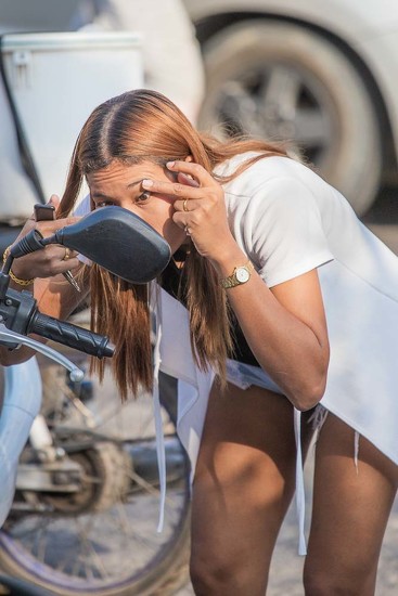
I must confess that I do not take or produce a great deal of monochrome photographs. I enjoy Street Photography particularly over in Asia which for me lends itself to this type of photography.
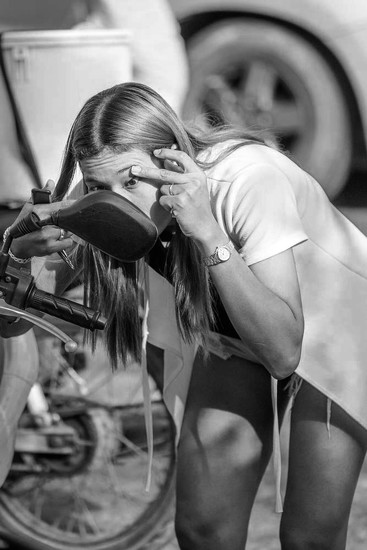
The lady’s hair appears sharper in the monochrome but overall I prefer the colour as it seems to have more impact.
Composition not ideal; at the time I had a long lens on the camera and was shooting across the road the scene manifested itself and it was a case of quickly get focus and shoot, before she moved on.
As far as colour v monochrome, perhaps I could have done more with contrast on the black and white? What do members think?
I'm typically love color, but in this case, I like the B&W version better. She does stand out more. You could have amped up the contrast a little, but only a little.
i also prefer the b&w. i might have bumped the contrast up a bit, and maybe also had a slight vignette at the edges and lightened her face just slightly so that she would stand out more. i really like that the image tells a story
the colour is much better !!
i think with the un-even /dappled light on her the colour helps the image make sense, and the blue tones with the orange tones nicely compliment each other.
Typically, I prefer B&W, but in this case I like the color version a little bit better. The color version has more separation between the woman and the wheel in the background.
It would be interesting to work on the B&W version a bit. Especially (as you noted) work with the contrast, bring up the blacks a touch. Maybe use burn and dodge a little to add some difference between subject and background. Keep it subtle, though.
While I am usually a black and white fan, this time I'm going with the color fans. I think she blends into the background too much in the monochrome version. If I was to do anything in the color version I'd desaturate the background just a bit so that her skin tone and hair separates from it a little bit more.

i think with the un-even /dappled light on her the colour helps the image make sense, and the blue tones with the orange tones nicely compliment each other.
It would be interesting to work on the B&W version a bit. Especially (as you noted) work with the contrast, bring up the blacks a touch. Maybe use burn and dodge a little to add some difference between subject and background. Keep it subtle, though.