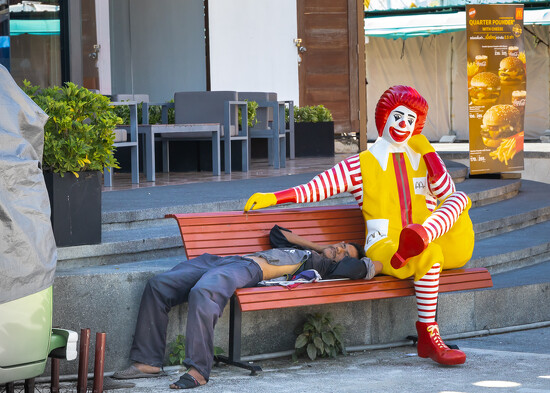
I take very few black and white photographs, however, I know some members love them and are able to produce excellent results. Perhaps the contrast in my black and white could be better, but the colour photograph is better for me in many respects.
What do members think? Please feel free to be cruel and harsh in comments.
You have some nice tones, and pure black and pure white in your image which keeps it from being "flat" instead of only shades of gray. I love black and white and shoot in black and white vs. converting to color. However, I'm old school and it's just a matter of personal preference. If you love color - shoot it. I still consider black and white an art form that I'm still trying to master. Color is well - color.
Yeah, definitely color for this shot. I agree with @joemuli that those colors are iconic for McD's.
I generally prefer color though - "Color is joy" as Ernst Haas said. I usually use B&W if the colors are overly distracting to the image or story I'm trying to tell... sometimes I'll use it if the tonal variations "work" too.
I agree with you in this shot that the tonal contrast doesn't quite work for B&W - it feels a bit off balance to me.
Whilst I do love black and white photography in this instance I feel colour is better (and great). As Joe says, the Ronald McDonald colours are iconic and really make the people stand out. Personally I'd probably crop out the burger sign and the green/grey thing on the left hand side because I find them a little distracting, and darken round the edges slightly. It may help focus even more on Ronald and the man - love the fact that he's sleeping on the bench and it looks like Ronald has his arm protecting him.
I prefer this image in color. The general feeling I get from it is a stark juxtaposition of wealth with abject poverty; of excess with want. When I remake "The Time Machine", I will adorn the entrance to the Morlock caves with McDonald's imagery. (OK - that might not be a perfect parallel, but it made me chuckle so I'm leaving it).
I think that message (assuming that's what you're going for) is more strongly stated using the gaudy colors and the excessive advertising (even when a customer has already chosen their store) McDonald's employs.
In this instance the colour image is much better. I love black & white and shoot many of my images with that in mind but not every image is suited to black and white. A suitable candidate for b&w conversion needs a good range of tones and good contrast. You really have to be thinking b&w at the time of exposure. And sometimes, as in your image here, colour is really the only option.
The garish colors are part of the clown's identity. Without it, you're in danger of confusing your viewer. I would, however, tighten the crop quite a bit. There's a lot of distraction that could be cut without hurting the composition.
To me some images just cry out to be black and white. And some look much better in colour! Of the two you have posted Ronald looks much better in colour.
Write a Reply
Sign up for a free account or Sign in to post a comment.
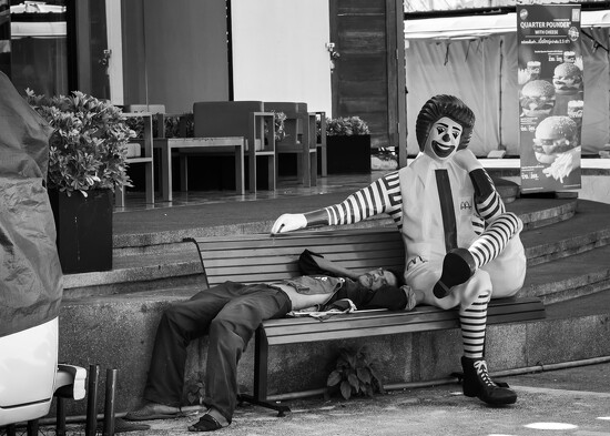

Have you considered as a compromise ( dare I type it.......) some selective colour???
What a fabulous candid street shot!!!
I generally prefer color though - "Color is joy" as Ernst Haas said. I usually use B&W if the colors are overly distracting to the image or story I'm trying to tell... sometimes I'll use it if the tonal variations "work" too.
I agree with you in this shot that the tonal contrast doesn't quite work for B&W - it feels a bit off balance to me.
I think that message (assuming that's what you're going for) is more strongly stated using the gaudy colors and the excessive advertising (even when a customer has already chosen their store) McDonald's employs.