
Over the years I've tweaked our image resizing algorithm to be as good as I can make it. Image resampling for the web is a tricky business, there is resizing, color-spaces and all sorts of other issues that have to be taken in to account, and it's difficult to strike a balance between quality, sharpness, contrast and file size (you don't want slow loading images).
Tonight I sat down to look at our image processing and where it can be improved, and I believe I've made a big leap forwards in how we sample your images - so now they will look even better than before!
As an example, the 3 images below are for comparison, they are our old system (top) which you can see has colours that aren't quite right, new system (middle) much better! and as a comparison, I uploaded the original to Flickr, then downloaded their scaled version and have shown that at the bottom.
As of today all new images coming in to the system will be processed using this new method, I hope you agree that the improvement is a good step forward, and I promise to continue to work on making this the best place to showcase your 365 Project!
Also: a big thank you to @gazbadger for his fabulous test image.
(the images below will have been resized for this blog, but just click them to view full size in a new tab.)
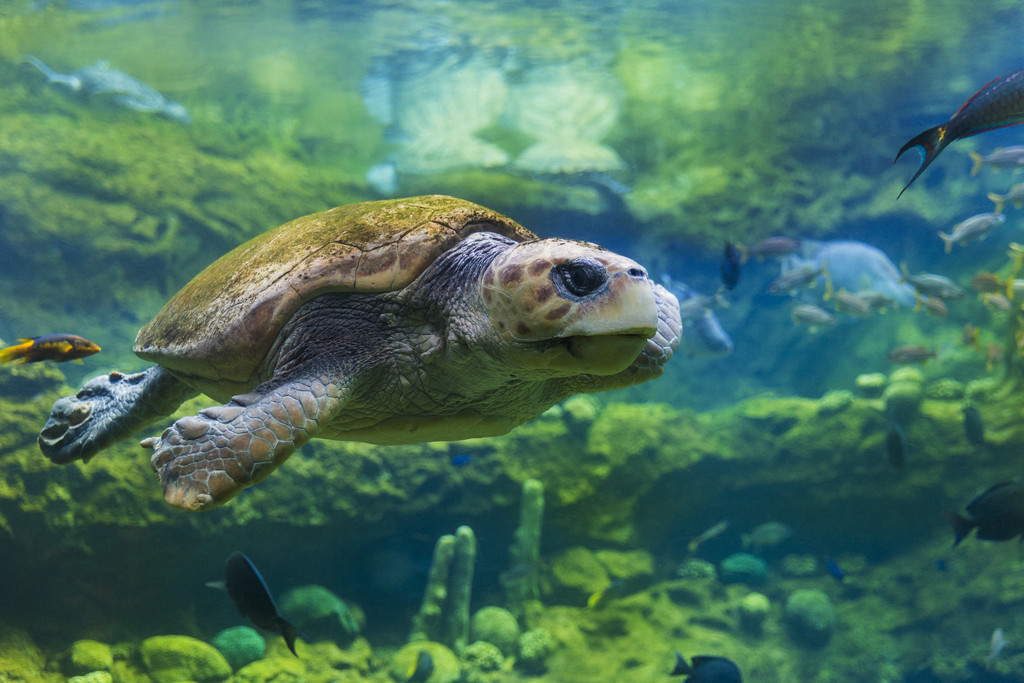

Sharpness is slightly worse on the new version than the old, but maybe that's just bad handling of this particular image, or a result of the higher compression? The Flickr version is still the sharpest of the three, according to Matlab, and confirmed by side-by-side comparison.
It does not detect what photographers would consider oversharpening, so yes, if you turn the sharpening factor up to a silly level then you'll score a very high mark. It's also not viable to compare sharpness between different source images (because they have different content) -- this image scores quite low on sharpness in all three samples, because of the large area of intentionally out-of-focus elements in the picture, and so it wouldn't be fair to compare it to, say, an image of a brick wall, but it's very good to compare the relative sharpness of the same image undergoing different sharpening techniques, as here. I did the analysis to compare the outcome to my own interpretation of the relative sharpness between the images.
To my eye, none of the three images look oversharpened to me, and the Flickr image is the sharpest of the three, as backed up by the mathematical analysis. You can see this especially clearly when comparing the 'new' method here, which is the least sharp of the three, with the Flickr image, and switching between them in two browser tabs, with noticeably crisper detail being present in the Flickr image on the shell, scales and 'cheek' area, for want of a better word!
The 'old' method is harder to compare because of the significant colour shifts, and also because it's a slightly different size, but I brought the old image into Photoshop and fixed the colour issue (by using the 'Assign Profile' option to tell Photoshop it was an Adobe RGB image that lost the attached profile), and can still tell a difference between that and the Flickr version, although it is definitely much more subtle, as backed up again by the analysis which shows the old method is closer to the Flickr image than the new method in sharpness.
Notably, the 'new' method has achieved a reduction of almost 33% in image size over the 'old' method, which I can appreciate is very valuable to you and your bandwidth bill, and is still acceptably sharp for most purposes, and with only very minor increases in compression artefacts. Similarly, I only have easy access to this single image, whereas I suspect you've done tests over a wide range of images, so although I can say this image is less sharp, I certainly don't suggest that all images will be less sharp using the new algorithms. I just wanted to highlight that in this particular case, although the colour space fix is obviously a huge step forward for those who don't know to use sRGB, the sharpness is slightly decreased compared to the old method.
Sharpening is a very complex process, and I don't believe there's any 'one-click' setting that will work perfectly for any image. This is compounded on a site like this by there being a huge variation in photographer's skill levels, with some uploading unprocessed phone images that will inherently be very soft, and others uploading images with very advanced sharpening already applied. It's very difficult to find a one-size-fits-all sharpening method for everything, and Flickr has had many years (and many engineers) to work on this issue. Indeed, I wouldn't be totally surprised if they were doing a similar analysis to what I did for these three images automatically to all uploads, and applying varying sharpening parameters based on the calculated initial image sharpness -- that's certainly an avenue I'd explore in their position.
This certainly isn't meant as a criticism -- as I say, I only have these three images to go on, and that's no indication of how the algorithm will perform on average compared to the old one. And further, none of the three images are what I would consider unacceptably soft by any means, just some are less sharp than others. The colour-space fix should remove the frequent complaints, especially at the start of the year, that the site is 'screwing up the colours', which is not good for the site even if the issue at heart lies with the photographer's post-processing workflow. And the bandwidth savings are significant on this image and, if shared amongst all images, I can see would have very positive implications on the site's financial situation. I just wanted to highlight that, for this specific image, once you eliminate the colour-space fix and focus solely on sharpness, it doesn't perform quite as well as the old method did.