I love the B&W. The bottom photo seems a little dark and it took me a second to even notice the woman in the photo. That could be the effect you're going for, I'm not sure, but I personally might try giving more light to the bottom photo. Still, both pics are very good in my opinion (which I am still very new to photography, so take my criticism with a grain of salt)
First is great, maybe positioned the girl more to the left. The second one i find hard to make out, could do with some more light on her head and shoulders!!
The first pic is lovely! The B&W works really well. I too, would position her slightly to the left, leaving the parasol to 'float' into the middle of the picture. The second is really hard to understand because it is very dark. I love your creativity however - keep at it!!
I love the top one, and I like the position she is in...I don't think the umbrella centered would look right. the second one made my brain hurt. I have no clue what's going on in it.
Love the top one. Maybe position slightly more to the left and crop a tiny bit from the top, not too much. The second one doesn't appeal so much. Too dark and hard to see any detail. Both are full of talent, however.
I think the first one has a bit too much sky, but overall it is a great photo and really makes you look deeper into it. The second one was a bit too dark so I am missing a real focal point in the photo.
i love the second one! the light levels are perfect and her body position is so well suited for the look you seem to be going for. it is a bit confusing but in a way that adds to the creepiness of it, because it takes you a second to focus on her. I think the processing is perfect too.
I think she's far too far from the camera in the first one and maybe it's not focused enough on her? Too much sky and grass perhaps? The setting, clothes, and girl are beautiful, so make more use of them. Also if she wasn't looking straight at the camera it would look more natural. Last but not least the black and white is nice because it's not too washed out. It tends to be better when using B&W to keep the blacks black, or it loses vitality. Anyway... I think you've done a great job and they're both pretty good. But I have to say I think the second is amazing :D
#1-too much sky,otherwise I love it,feels fresh
#2- i was thinking she was possessed, and it needs some light onto the girl frontal area, so the 3 dimensions show, maybe behind her
I think your photos are very dramatic, fresh, and creative, I'm glad you shared them
i personally prefer number 2. it has an almost high fashion shoot feel about it, quirky and very artsy, not sure whats going on but it looks like something from a magazine like frankie or vice, well done
Write a Reply
Sign up for a free account or Sign in to post a comment.


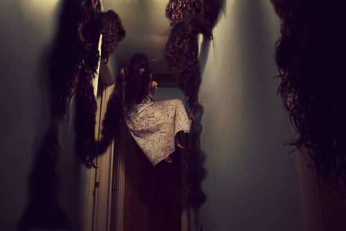
the second one I can't make out. suggest more light..
I think she's far too far from the camera in the first one and maybe it's not focused enough on her? Too much sky and grass perhaps? The setting, clothes, and girl are beautiful, so make more use of them. Also if she wasn't looking straight at the camera it would look more natural. Last but not least the black and white is nice because it's not too washed out. It tends to be better when using B&W to keep the blacks black, or it loses vitality. Anyway... I think you've done a great job and they're both pretty good. But I have to say I think the second is amazing :D
I don't think the bottom one needs more light. I just like the disturbing image of the woman in the corner
#2- i was thinking she was possessed, and it needs some light onto the girl frontal area, so the 3 dimensions show, maybe behind her
I think your photos are very dramatic, fresh, and creative, I'm glad you shared them