Sandbox has previously looked how to use layered textures in Photoshop / Elements / Gimp, or purchased plugins like Topaz Textures and Alienskin Exposure. If you have an ACE account you can even use Picmonkey to add textures and you have the option of loading your own texture.
The use of textures is currently very fashionable, but it is by no means new - Victorian era photographers used purchased glass plate textures to add texture in their darkrooms. Smartphone instagram-type filters also make heavy use of textures – adding a texture can camouflage an image that has high noise/ISO levels, or it can create an aged look, and add ‘depth and complexity’ to digital images.
Choosing what texture to use is a subjective process, and it involves a bit of trial and error. Decide what look are you aiming for the final image. While there are thousands of textures available - adding textures to your photos
sometimes you may want to create or modify your own textures. This tutorial discusses a few of the ways you can do that.
You might need to review the earlier Sandbox tutorials on textures before trying this tutorial. Practice and discussion on using layers, blend modes and textures will be found here:
Fine art photography
http://365project.org/discuss/themes-competitions/25344/sandbox-365-fine-art-photography
Factors that influence how a texture affects an image
Blend mode selection will have the most striking influence, but you can also use ‘blend-if’.
Opacity choice will depend on blend mode & the overall file look. If you are unsure about a blend mode or texture, start at 50% opacity, but it is commonly somewhere between 15-75%. But be aware that what looks dreadful at 75% might be perfect at 15%, so try a few different settings. An understanding of blend mode theory can help, but is not essential.
A dust & scratch grunge texture (white on black) is worth trying with screen mode to make the scratches stand out, While music notes on white paper might be used in multiply mode to make the notes stand out & the white paper magically disappear.
Masking can help control textures – mask the subject at varying opacities of the mask if you don’t like the texture on the subject.
• colour - the influence of a texture on image colour will depend on the texture chosen and the blend mode used. You can adjust the saturation or colour of the texture before applying it to your photograph to avoid unwanted colour change in your image.
If you use a texture in ‘overlay’ blend mode you will increase overall image contrast, so consider the native contrast of the texture.
• lightness – water ripples, clouds or vignettes can add complexity to an image. Often used with screen (to lighten)or multiply (to darken) blend modes.
• if you want a gritty distressed look, look for grunge textures, painterly effects , or use brush-like textures.
If you are unable to find exactly the texture you are after, why not modify one you already have, or make your own ---
Photograph your own
• eg canvas; creased, crumpled, antique paper
A tripod and aperture number of f/8 or over for focus of metal/concrete/walls. Use natural light or off-camera flash.
Mirror lockup (eg Canon ‘Liveview’) and 2 second delay to minimize camera shake.
• Intentional blur / movement can work to capture colours and form
‘Blend’ your own
open two or more photos or textures in your editing program and use different layer blend modes ( see ……). Experiment until you get a look you like. @kali66 has a lovely example of this.
http://365project.org/kali66/2015/2016-03-24
‘Craft’ your own
• You can grab a paintbrush and paper then scan or photograph the image when it is dry. It does not need to be a masterpiece – it depends on the look you are after – use a large brush quite wet with sweeping strokes, or even dab randomly…. You can paint a ‘frame’ (using black paint), or even random coloured watercolour paint spatters.
If crafting with paint is not your thing, you can apply a watercolour editing filter to an existing texture or photographic image.
• You can use filters such as oil paint or watercolour filters in an editing program to create paper/canvas type textures link
• scan leaves/paper/ fabrics/ anything that fits…for natural texture
Change a texture you already have
There is a filter in PS called ‘Colour lookup’ that will give change the hues in a very natural manner - http://layersmagazine.com/fashion-toning-using-photoshops-color-lookup-adjustment-layer.html
@roseolivia has posted a wonderful example of fineart colouring using colour lookup and textures.
http://365project.org/roseolivia/365/2015-05-11
focus – use Gaussian blur to ‘soften’ the mood of a texture. Use ‘motion blur’ to add tension.
• Emboss the texture using an embossing filter & then use overlay blend mode to give a 3D effect without changing the colour of the base image. ( eg canvas, paint strokes, craquelure, peeling paint)
• desaturate the texture (eg clouds) and use overlay or screen mode for ‘fog’ or smokey effects. Worked example
1. Capture an image – I liked the light & colour coming through the trees so I took a shot with some intentional movement to soften the texture. (left pic ) you can see it is not a wonderful image, but the random colour and lightness is what I was after.
2. Edit image for balanced colour and levels if needed
3. Crop an area if needed ( in this case the top left area was chosen) (top right pic )
4. texture (bottom right pic)
You can use the file as is, or further refine it:
At the top is the final texture, and below that is a version where I applied a painterly filter & used denoise filters
Here is the painterly texture (top), and to mix things up, for the bottom image (pink version) I applied an adjustment layer of lookup colour (use 3DLUT file setting and 2strip.look colour toning adjustment). One click & I have two very different textures! See this very good Lynda.com video showing how easy it is to use colour lookup
You can also adjust colour of a texture you already have by using a hue & saturation adjustment layer - but in a targeted way – look at this PHLEARN video
Using the texture
I decided to use the green painterly texture at 70% normal blend mode and the one from http://365project.org/kali66/2015/2016-03-24 at 60% linear burn mode.
I chose an OK, but not exceptional, image of a moth to apply the textures to. Open the image and then paste the two texture layers into the file. (Save the file as a .psd in PS, and don’t forget to hit save frequently)
I resized and moved the green & yellow texture so that the large yellow area would sit around the moth, and I also resized the blue one and used only the top 2/3rds of the texture.
I also added a cloud texture, and did some minor colour & curves tweaks, and added masks to reduce the texture (but low opacity mask on the colour texture layer)
And finally, do remember – just because you can do something, doesn’t mean you have to use it at 100%, or for every edit. HDR is a useful concept too, but a neon glow can be overkill on every image. Refined application of overlay textures means use it to complement your original image. Sometimes less means more, except for ETSOOI for fun of course!
Feel free to post here and share your favourite images using textures that you have made, or your source of inspiration for textures, tutorials or techniques. These are just a few ways of creating textures – I am sure there are plenty more!
Good primer on textures. I've used them in a couple of my photos this month to add a grungy/urban decay feel. The effect is fairly subtle. From memory, I set the opacity on the texture layer at somewhere around 25% for the first photo and 40% for the second.
Write a Reply
Sign up for a free account or Sign in to post a comment.

The use of textures is currently very fashionable, but it is by no means new - Victorian era photographers used purchased glass plate textures to add texture in their darkrooms. Smartphone instagram-type filters also make heavy use of textures – adding a texture can camouflage an image that has high noise/ISO levels, or it can create an aged look, and add ‘depth and complexity’ to digital images.
Choosing what texture to use is a subjective process, and it involves a bit of trial and error. Decide what look are you aiming for the final image. While there are thousands of textures available - adding textures to your photos
sometimes you may want to create or modify your own textures. This tutorial discusses a few of the ways you can do that.
You might need to review the earlier Sandbox tutorials on textures before trying this tutorial. Practice and discussion on using layers, blend modes and textures will be found here:
Introducing layers
http://365project.org/discuss/themes-competitions/24528/365-photoshopan-intro-to-using-layers
multiplicity
http://365project.org/discuss/themes-competitions/24583/365-photoshopbuilding-on-layers-multiplicity-or-cloning
White Balance
http://365project.org/discuss/themes-competitions/26271/sandbox-surgery-white-balance
Digital Textures
http://365project.org/discuss/general/24704/sandbox-365-digital-textures
Levitation
http://365project.org/discuss/themes-competitions/25056/sandbox-levitation
Fine art photography
http://365project.org/discuss/themes-competitions/25344/sandbox-365-fine-art-photography
Factors that influence how a texture affects an image
Blend mode selection will have the most striking influence, but you can also use ‘blend-if’.
Opacity choice will depend on blend mode & the overall file look. If you are unsure about a blend mode or texture, start at 50% opacity, but it is commonly somewhere between 15-75%. But be aware that what looks dreadful at 75% might be perfect at 15%, so try a few different settings. An understanding of blend mode theory can help, but is not essential.
A dust & scratch grunge texture (white on black) is worth trying with screen mode to make the scratches stand out, While music notes on white paper might be used in multiply mode to make the notes stand out & the white paper magically disappear.
Masking can help control textures – mask the subject at varying opacities of the mask if you don’t like the texture on the subject.
• colour - the influence of a texture on image colour will depend on the texture chosen and the blend mode used. You can adjust the saturation or colour of the texture before applying it to your photograph to avoid unwanted colour change in your image.
If you use a texture in ‘overlay’ blend mode you will increase overall image contrast, so consider the native contrast of the texture.
• lightness – water ripples, clouds or vignettes can add complexity to an image. Often used with screen (to lighten)or multiply (to darken) blend modes.
• if you want a gritty distressed look, look for grunge textures, painterly effects , or use brush-like textures.
@humphreyhippo has generously placed a bunch of created textures on the
web at Deviantart
If you are unable to find exactly the texture you are after, why not modify one you already have, or make your own ---
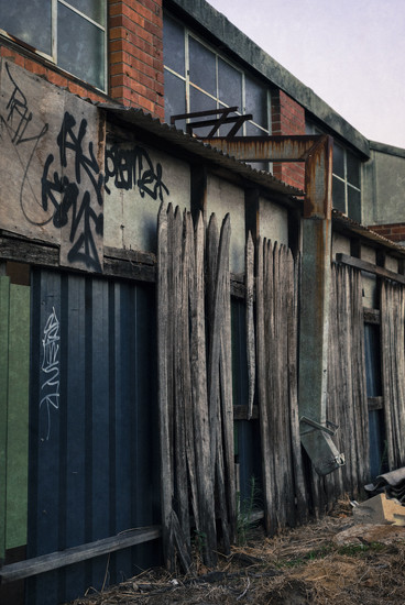
Photograph your own
• eg canvas; creased, crumpled, antique paper
A tripod and aperture number of f/8 or over for focus of metal/concrete/walls. Use natural light or off-camera flash.
Mirror lockup (eg Canon ‘Liveview’) and 2 second delay to minimize camera shake.
• Intentional blur / movement can work to capture colours and form
how to photograph textures
‘Blend’ your own
open two or more photos or textures in your editing program and use different layer blend modes ( see ……). Experiment until you get a look you like.
@kali66 has a lovely example of this.
http://365project.org/kali66/2015/2016-03-24
‘Craft’ your own
• You can grab a paintbrush and paper then scan or photograph the image when it is dry. It does not need to be a masterpiece – it depends on the look you are after – use a large brush quite wet with sweeping strokes, or even dab randomly…. You can paint a ‘frame’ (using black paint), or even random coloured watercolour paint spatters.
If crafting with paint is not your thing, you can apply a watercolour editing filter to an existing texture or photographic image.
• You can use filters such as oil paint or watercolour filters in an editing program to create paper/canvas type textures
link
• scan leaves/paper/ fabrics/ anything that fits…for natural texture
Change a texture you already have
There is a filter in PS called ‘Colour lookup’ that will give change the hues in a very natural manner - http://layersmagazine.com/fashion-toning-using-photoshops-color-lookup-adjustment-layer.html
@roseolivia has posted a wonderful example of fineart colouring using colour lookup and textures.
http://365project.org/roseolivia/365/2015-05-11
focus – use Gaussian blur to ‘soften’ the mood of a texture. Use ‘motion blur’ to add tension.
• Emboss the texture using an embossing filter & then use overlay blend mode to give a 3D effect without changing the colour of the base image. ( eg canvas, paint strokes, craquelure, peeling paint)
• desaturate the texture (eg clouds) and use overlay or screen mode for ‘fog’ or smokey effects.
Worked example
1. Capture an image – I liked the light & colour coming through the trees so I took a shot with some intentional movement to soften the texture. (left pic ) you can see it is not a wonderful image, but the random colour and lightness is what I was after.
2. Edit image for balanced colour and levels if needed
3. Crop an area if needed ( in this case the top left area was chosen) (top right pic )
4. texture (bottom right pic)
You can use the file as is, or further refine it:
At the top is the final texture, and below that is a version where I applied a painterly filter & used denoise filters
Here is the painterly texture (top), and to mix things up, for the bottom image (pink version) I applied an adjustment layer of lookup colour (use 3DLUT file setting and 2strip.look colour toning adjustment). One click & I have two very different textures! See this very good Lynda.com video showing how easy it is to use colour lookup
You can also adjust colour of a texture you already have by using a hue & saturation adjustment layer - but in a targeted way – look at this
PHLEARN video
Using the texture
I decided to use the green painterly texture at 70% normal blend mode and the one from http://365project.org/kali66/2015/2016-03-24 at 60% linear burn mode.
I chose an OK, but not exceptional, image of a moth to apply the textures to. Open the image and then paste the two texture layers into the file. (Save the file as a .psd in PS, and don’t forget to hit save frequently)
I resized and moved the green & yellow texture so that the large yellow area would sit around the moth, and I also resized the blue one and used only the top 2/3rds of the texture.
I also added a cloud texture, and did some minor colour & curves tweaks, and added masks to reduce the texture (but low opacity mask on the colour texture layer)
And finally, do remember – just because you can do something, doesn’t mean you have to use it at 100%, or for every edit. HDR is a useful concept too, but a neon glow can be overkill on every image. Refined application of overlay textures means use it to complement your original image. Sometimes less means more, except for ETSOOI for fun of course!
Feel free to post here and share your favourite images using textures that you have made, or your source of inspiration for textures, tutorials or techniques. These are just a few ways of creating textures – I am sure there are plenty more!
@ltodd