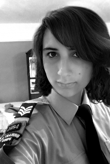
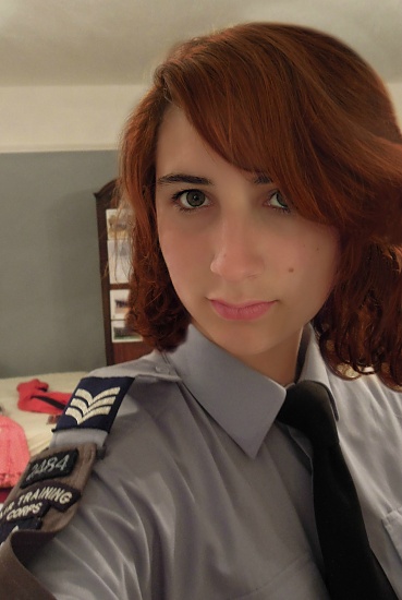
Ever had those photos where you JUST CAN'T DECIDE whether to have them as black&white or colour? My photograph for yesterday (29th August) has this problem. Could you please give your thoughts on which works better...
I understand what you are saying because I have the same trouble sometimes not knowing whether to use color or B&W. I generally always like color, though, and In this lovely portrait I would say I like the colored one better. They are both really good, though, and I am no expert.
My first reaction was I preferred B&W. Although it feels like you may have done some other processing as well. The angle of the wall behind the portrait seems to have much more contrast in the B&W making it a white stripe that is distracting. The shadows and highlights on the face are harder in the B&W as well. I am not an expert on any of this. Just things I noticed.
I think you reddish brown hair lends itself more naturally to color. It's one of your best features, not to mention your green eyes.
I'm not a fan of the holding the camera up to do a self portrait because it looks exactly like what I just described. See if you can set the camera on a dresser and use the timer. Also, become more aware of your background. You didn't really want that messy bed behind you to draw attention away from your beauty, did you? :-)
@tryeveryday@mittens Thank you :) @tigerdreamer Yeah I understand where you are coming from, I am not sure why that white stripe has appeared - must be something to do with the B&W editing. @cromwell Thanks, I do normally use timers etc, and as bad as this sounds, I couldn't this time as I was a bit rushed! This very bad excuse also applies to the background. I do normally think about this but there is never anywhere suitable that still has decent lighting.
Your skin complexion, hair color, etc. are beautiful in color. I also like that the clutter in the background looks less noticeable in b&w, though. :) You could rotate the color picture just a tad to remove the clutter from the frame, bring your face a little bit more center, and maybe even remove enough of your outreached arm to make it less noticeable, too.
@jjefferies Nice edit! If I can offer a bit of constructive criticism - the background is a bit distracting (clothes on the bed) - it is always good to control your entire frame, don't let anything in the frame that you don't want in there. Or use a large (low numeric) aperture setting to blur the background if you can't remove it!
Although, I do like the angle in the edited version ... it would also be easy to use the "clone" effect and just get a white spot from your bed and paint it over the pink clothes so that you "erase" them from the picture. That would be another possible solution.
@jjefferies I like your newest version with the tighter crop - the angle is great. Robyn's latest version is even better as it is very clean, see how much better your portrait looks when the distracting background is removed?
What's interesting is the initial attention getter is dramatically different in the color versus b&w versions. In the b&w version, I'm immediately drawn to her eyes. They're expressive and captivating and they capture the attention immediately. In the color version, I'm immediately drawn to her hair. In that version, my eyes then wander through the scene and I think I end up capturing more detail in the long run. As to which is better, well, I think it really depends what you want to say with the photo. The b&w captures me immediately but the color version forces me to study the photograph longer.
This last is a real portrait photo. This is one that really draws you in to look at it. The angle is great, the distractions in the background gone, the element of the uniform is still there - this is lovely.
I liked the black and white one but the mirror? in the background is so bright that you immediately start to look at it, instead of the subject. The crop gets rid of the visible "holding my camera at arm's length" look, too.
@soboy5 I agree with you totally. (with permission) I will replace my edit with Robyn's @rockinrobyn because it is that good.
@kannafoot Your comment is very interesting. I see what you mean. I think the longer you make someone stay on one photograph, the more they will like it..?
@carmel Perhaps once the crop angle blur etc is removed from the colour, I re-try doing a black and white version using slightly different settings to make it less bright but still keeping a wide range of tones.
@ericaw Thanks for your addition to the discussion :)
I thought I answered earlier, but now cannot remember. I once read that instead of hitting the black and white option, that if you slowly adjust the saturation (by taking away the color) and then adjust the contrast, you can get a really nice finish and a hint of color tone.
For me, the choice depends on whether the colour makes the shot, or whether the it distracts, and you'd rather focus on shadows/contrasts. I think here the colour is better because it's a portrait featuring beautiful hair and eyes - these are things I'd definitely think deserve pops of colour :)
Composition has already been well covered so I'll talk about the b&w aspect.
I use this thought process when processing in b&w or sepia. Does either of those processes add any "emotion" or "feeling" to the image? That's really what those processes are for IMO. The b&w takes away from the great colors of your hair and eyes so it takes away from the emotion or feeling of the picture in this case.
I prefer the color version.

I'm not a fan of the holding the camera up to do a self portrait because it looks exactly like what I just described. See if you can set the camera on a dresser and use the timer. Also, become more aware of your background. You didn't really want that messy bed behind you to draw attention away from your beauty, did you? :-)
Thank you for your comments :)
Maybe a softened/blurred black& white background with colour foreground could work??
if u cant clone background try blurring it. :)
I liked the black and white one but the mirror? in the background is so bright that you immediately start to look at it, instead of the subject. The crop gets rid of the visible "holding my camera at arm's length" look, too.
@kannafoot Your comment is very interesting. I see what you mean. I think the longer you make someone stay on one photograph, the more they will like it..?
@carmel Perhaps once the crop angle blur etc is removed from the colour, I re-try doing a black and white version using slightly different settings to make it less bright but still keeping a wide range of tones.
@ericaw Thanks for your addition to the discussion :)
I use this thought process when processing in b&w or sepia. Does either of those processes add any "emotion" or "feeling" to the image? That's really what those processes are for IMO. The b&w takes away from the great colors of your hair and eyes so it takes away from the emotion or feeling of the picture in this case.
I prefer the color version.