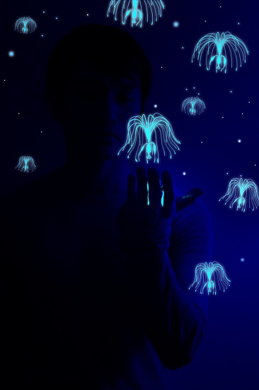
I think the first one has less blurring of the larger jellyfish but the second one has some more brightness to it eg the small jellyfish and stars in the top left corner
I feel like Im at the eye doctor, # 1 or #2 .. I have to say 1 is clearer for me, but I have crappy eye sight and its late and Ive had my meds,, lol so dont take my answer into account....
If you look at those little points of light, or stars, the ones uploaded here are just a little bit bigger than the one from Multiply. It also looks just a little brighter....more detail !
they look the same to me..(my beautiful eyes are.. tired already looking at these beautiful photos on 365 project..for 3 straight hours..everyday.hahaha..) but the lower (2nd) i think is...wait ,i think the first....oh..jay sorry..!!:(
365project resamples the images you upload. Check the filesizes of your two images, you'll probably notice a huge difference. Here's a very strong example of the same thing...
First off, the raw image exported from Lightroom...
Note the crisp, straight lines, vibrant reds, and deep blueish tint at the bottom of the right side. Now the image after uploading to 365...
Note the dull washed out reds, lack of strong blue tint, and worst of all the pixel-ness of the lines, most notable on the rightmost red line.
The first images is ~180KB, the second one ~60KB. Nothing you can do, the website resamples the images to save diskspace.
@gavincci 2nd one is clearer - and my glasses haven't arrive yet. sorry everyone who says 1, I'm looking at the fine lines of the 'jellyfish' and there [in my eyes] appears to be less blurring in them
I think in terms of sharpness I'd have to say #1 but I think the colors are more vibrant in #2. Very close- I had to look for a while to see a difference. This is a fab pic btw :D
Yeah also I should've mentioned - the jpeg algorithm will work better on some colours/edges than others. Or, will appear to. Which is why some people are saying your #1 looks sharper, and some #2, depending which bit they notice first. It's particularly bad at red, which is why my smaller one looks so bad.
PNG will be sharper yeah, as it's uncompressed. I didn't realise they were PNGs! I may be an enormous div. PNG is a lossless format so everything I posted about the compression and such - doesn't apply. That's only with JPG.
The first one looks clearer with more contrast. The second one looks more vibrant though. I prefer the first one. This is a great pic, so good job either way!!

the other one from here....
how come the 2nd one is more like (blured)?
i think has somthin to do with my browser or connection .... thanks thanks .... =)
thanks...
this one is from flickr.
First off, the raw image exported from Lightroom...
Note the crisp, straight lines, vibrant reds, and deep blueish tint at the bottom of the right side. Now the image after uploading to 365...
Note the dull washed out reds, lack of strong blue tint, and worst of all the pixel-ness of the lines, most notable on the rightmost red line.
The first images is ~180KB, the second one ~60KB. Nothing you can do, the website resamples the images to save diskspace.
@eyebrows got it steve! =) thanks soo much ...now i know .... =)
@misschuff but the picture of my shoulder in the top photo is sharper than the 2nd one ....