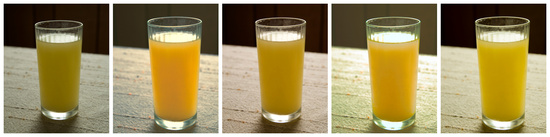
I was trying to color correct the image on the left to make it look more "orange." Each one looks right when I do it, but when they go side by side, they are all different. How do you tell when a color is "right."
To me the second one looks the best. I'm not a professional or anything but what I do sometimes when I change colours or saturation is to make it too much, really oversaturated, and then go back a notch until it looks realistic again. It might work too for your orange...
Number two is the most appealing to me for colour, but I have no idea if it's the most accurate to the actual scene.
Colours are affected by the light that illuminates them -- the same object will appear different on a sunny day to a cloudy day, and far different under incandescent lighting than it does under fluorescent lighting. Our eyes are very good at adjusting for those changes so that, except under extreme lighting like sodium street lights, we often barely notice. The camera is a lot less capable of doing this.
The best way to get an accurate colour from the camera is to use the correct white balance, either by selecting an appropriate white balance in the camera menus (daylight, cloudy, tungsten, fluorescent, etc.), or for the best possible accuracy, using a custom white balance. This is done by shooting something known to be neutrally-coloured, and then telling the camera to use that as true white. You can buy special white balance cards that are truly neutral, but a white piece of paper is usually close enough. There's some details on how to do this here: http://www.digitalcameraworld.com/2012/05/23/how-to-set-custom-white-balance-for-perfect-colours/
Even this requires the scene to be lit by one type of light source to be truly accurate -- if the scene is lit both by fluorescent lighting and from a window, then you'll have multiple white balances, which is far more difficult to cope with (the simplest way in these cases is to remove one, by either switching off the lights or blocking the window!)
Once you have the correct white balance, you'll still need to make sure you get your exposure pretty close. How we perceive the colour is affected by how bright it is, so underexposing or overexposing will still result in it not looking like it did in real life. Automatic or priority modes in cameras usually do a pretty good job of this, but just be aware, especially in challenging situations like the above where you have a big dark area above the glass that can fool the camera into over-exposing the image.
Finally, you should make sure that you don't have an aggressive picture style set in the camera, with a high contrast or saturation setting, which causes the camera to do some post-processing as it saves the image, moving you away from a truly accurate rendition of the scene.
Of course, all this only gets you towards capturing what the colour actually was. If you are aiming to record the scene accurately, then that's a good goal to aim for, but equally, some photographers may prefer to manipulate the scene so that the orange juice looks more like we imagine it than like it really is. In photography, there are very few rights and wrongs, just varying opinions :)
@frankhymus Nope, although on Canon at least, if you process the raw image using Canon's own software (DPP), it will automatically apply the picture style selected when the photo was taken to the raw file when it opens it. That's reversible of course, and no third-party raw processors do that.
Also note that (again, at least on Canon), picture styles do affect both the preview on the rear of the screen and (more importantly in my opinion), the in-camera histogram, even when shooting in raw only. So if you apply a high-contrast picture style the histogram will show under/overexposed areas which aren't actually under/overexposed in the raw data.
Edit: And of course, if you do shoot in raw, you can fix white balance issues later, although a reference point can still be very useful. And a similar caveat applies -- using the 'wrong' white balance to preview images on the back of the camera may indicate the photo is correctly exposed, but when you fix it later, you may risk oversaturating colours, as the raw data is shifted to a different white balance setting. I think this should always be fixable by recovering the highlights, but you need to keep an eye on your raw processor's histogram when making significant white balance adjustments after-the-fact.
@abirkill Thanks Alexis. I didn't think I had been smoking anything funny. Nikon does exactly the same and behaves the same way with their own software too.
If folks do shoot raw and use post tools like Photoshop, I'd suggest going to the Camera Profile options in Camera Raw (or equivalent) and, for Adobe anyway, over-ride the Adobe default to at least "Camera Standard" as a place to start. Perhaps match it to the in camera setting. Or at least look at options available there, or make your own. The Adobe Standard default is a blah and ho-hum place to start, and the camera's styles are at least specific to the camera, not a global default.

Colours are affected by the light that illuminates them -- the same object will appear different on a sunny day to a cloudy day, and far different under incandescent lighting than it does under fluorescent lighting. Our eyes are very good at adjusting for those changes so that, except under extreme lighting like sodium street lights, we often barely notice. The camera is a lot less capable of doing this.
The best way to get an accurate colour from the camera is to use the correct white balance, either by selecting an appropriate white balance in the camera menus (daylight, cloudy, tungsten, fluorescent, etc.), or for the best possible accuracy, using a custom white balance. This is done by shooting something known to be neutrally-coloured, and then telling the camera to use that as true white. You can buy special white balance cards that are truly neutral, but a white piece of paper is usually close enough. There's some details on how to do this here:
http://www.digitalcameraworld.com/2012/05/23/how-to-set-custom-white-balance-for-perfect-colours/
Even this requires the scene to be lit by one type of light source to be truly accurate -- if the scene is lit both by fluorescent lighting and from a window, then you'll have multiple white balances, which is far more difficult to cope with (the simplest way in these cases is to remove one, by either switching off the lights or blocking the window!)
Once you have the correct white balance, you'll still need to make sure you get your exposure pretty close. How we perceive the colour is affected by how bright it is, so underexposing or overexposing will still result in it not looking like it did in real life. Automatic or priority modes in cameras usually do a pretty good job of this, but just be aware, especially in challenging situations like the above where you have a big dark area above the glass that can fool the camera into over-exposing the image.
Finally, you should make sure that you don't have an aggressive picture style set in the camera, with a high contrast or saturation setting, which causes the camera to do some post-processing as it saves the image, moving you away from a truly accurate rendition of the scene.
Of course, all this only gets you towards capturing what the colour actually was. If you are aiming to record the scene accurately, then that's a good goal to aim for, but equally, some photographers may prefer to manipulate the scene so that the orange juice looks more like we imagine it than like it really is. In photography, there are very few rights and wrongs, just varying opinions :)
Also note that (again, at least on Canon), picture styles do affect both the preview on the rear of the screen and (more importantly in my opinion), the in-camera histogram, even when shooting in raw only. So if you apply a high-contrast picture style the histogram will show under/overexposed areas which aren't actually under/overexposed in the raw data.
Edit: And of course, if you do shoot in raw, you can fix white balance issues later, although a reference point can still be very useful. And a similar caveat applies -- using the 'wrong' white balance to preview images on the back of the camera may indicate the photo is correctly exposed, but when you fix it later, you may risk oversaturating colours, as the raw data is shifted to a different white balance setting. I think this should always be fixable by recovering the highlights, but you need to keep an eye on your raw processor's histogram when making significant white balance adjustments after-the-fact.
If folks do shoot raw and use post tools like Photoshop, I'd suggest going to the Camera Profile options in Camera Raw (or equivalent) and, for Adobe anyway, over-ride the Adobe default to at least "Camera Standard" as a place to start. Perhaps match it to the in camera setting. Or at least look at options available there, or make your own. The Adobe Standard default is a blah and ho-hum place to start, and the camera's styles are at least specific to the camera, not a global default.