It's possible that the answer(s) to this question are quite complex and I'll learn them only by experience and study. But just on the off chance that there are some simple tips which would help, here goes:
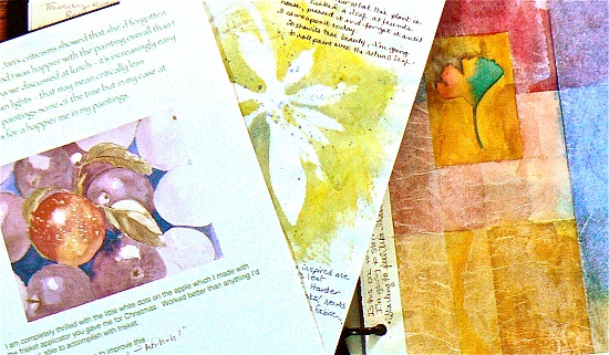
Today I uploaded a photo of some paintings from my art journal:
I loaded and deleted this about six or seven times, trying to edit to get the colors closer to reality once they were posted. They looked pretty close to the actual colors straight from my camera and even better on my monitor after I did some minor adjustments. But each time I uploaded the photo it'd be awful in color in some different way.
So - are there any rules that apply all or most of the time when you go from computer monitor to 365 view? e.g. - do you always warm the temperature up, cool it down, go more red or green on tint? Anything that is a quick tip or even what I should be reading somewhere would be helpful.
It's a tough one. There have been a few discussions on it, but the short version is that the database resamples the image (compresses it), reducing overall quality. Different browsers can also give slightly different results. And then there is the difference between displays (monitors). My own display, for example, is carefully calibrated using a Spyder3 Pro, with active adjustments made automatically with changes in ambient lighting. What I see on my screen is (almost) identical to what I get back on a print from my lab (almost, because a monitor can't display 100% of the Adobe RBG colour space - 98% at best if you have a $6k Eizo screen), but most displays are adjusted for saturation and brightness (people like pretty colours) right out of the factory, so things always look more vivid than they should. So, if it looks "washed out" to you on your screen, it is probably even more washed out on mine.
Because of all those variances, I don't even worry about trying to get the colour right. If it is way off, I may make a few adjustments, but generally I don't bother. Unfortunately, I haven't found a "best method" to get it right. What usually works though, for me at least, is to resize the image before uploading (to just slightly larger than it will display here - 1500 pixels on the long edge), add some extra sharpening, and save at 95% quality (I do that mostly just to make the upload quicker). It usually gets me close enough that I don't care.
@jinximages great advice. I am blue green color blind, which is why I tend not to focus so much on the color difference, but I do like the resizing method and adding some sharpening.
@brumbe - thank you again (as I indicated in my note on your page). @jinximages - thank you so much for taking the time to give one of your thoughtful informative responses. I am now otally satisfied now that I can just let this go with, at most, the few sizing adjustments you mention. I see that I don't really have much control over what people see anyway, so I'm going to stop fussing about it. Or maybe I could go to each of their homes and work with their monitors . . .
@reba Haha! You don't know how often I wish I could go to clients' homes and calibrate their monitors! I'm always getting phone-calls about how "the pink dress looks almost white" and such, and always tell them to come to my office and check on a good screen! And without fail I get responses like, "Wow, my screen looks nothing like this!"
And really, that's why in-person ordering is the only way to go. Online galleries for clients just make them think the wrong thing.
@brumbe Don't need to worry too much about green/blue issues - if the white balance is correct, it will usually be fine, so just look for correcting yellow/green castes in the "whites" and no-one will ever know. :)
@jinximages and that is why after playing with white balance I trust it most on Auto verses using a pre setting. I went back to look at my photos and other than sky and water and an occassional plant, blue and green are missing from my subjects. Thanks for the advice.
also i took a bunch of comp classes, and its apple and oranges, we would do an adobe project, and go to print it, and wow, what a diffeance, what a screen shows, and what we get is 2 differant things most of the time...
@sunnysmiles Thanks. I feel so much better. I'm even noticing that the images look different on my laptop and on the nicer monitor I use beside it. There are so many factors affecting how it looks to an individual viewer.

Because of all those variances, I don't even worry about trying to get the colour right. If it is way off, I may make a few adjustments, but generally I don't bother. Unfortunately, I haven't found a "best method" to get it right. What usually works though, for me at least, is to resize the image before uploading (to just slightly larger than it will display here - 1500 pixels on the long edge), add some extra sharpening, and save at 95% quality (I do that mostly just to make the upload quicker). It usually gets me close enough that I don't care.
@jinximages - thank you so much for taking the time to give one of your thoughtful informative responses. I am now otally satisfied now that I can just let this go with, at most, the few sizing adjustments you mention. I see that I don't really have much control over what people see anyway, so I'm going to stop fussing about it. Or maybe I could go to each of their homes and work with their monitors . . .
And really, that's why in-person ordering is the only way to go. Online galleries for clients just make them think the wrong thing.
@brumbe Don't need to worry too much about green/blue issues - if the white balance is correct, it will usually be fine, so just look for correcting yellow/green castes in the "whites" and no-one will ever know. :)