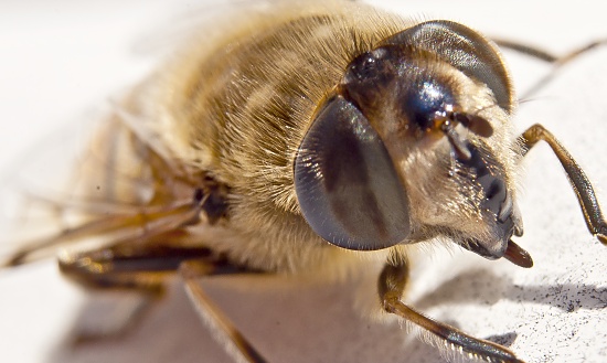
Hi guys, I would really appreciate your critique, tips or remarks on this photo. I'm still trying to improve my macro and cropping skills.
I only gave it a very slight crop. I had the bee filling the frame exactly, but I wanted to get just a bit closer. Now I'm wondering if I should have gone even further into the image, cropping it even tighter. On the eyes for example. Or is this a good balance? What do you think? Really, I'd like to know, feel free to be critical.
(one of my goals for this year is my instinct to crop things as if they should go into a documentary or biology book. I tend to want to put something as complete as possible into a frame and find cropping very difficult to do. Still, that's why photography is so much fun, there's always something to learn)
The crop looks good as is ! I don't think you can zoom in on the eye anymore with a front shot....maybe from the side ! The only thing I can see that would improve this a little is to play with it in levels....maybe calm down the highlights a little !
I see what you mean on the levels @nyweb. I processed the raw image on my netbook, and I still need to tweak my monitor settings there, it is set too dark. When I use my normal computer it does indeed look a bit brighter than intended. Thanks for that and also for taking the time and effort to share your thoughts.
I wouldn't crop any more, the front of the head is out of the focal plane and would detract from the overall quality if enhanced. This is a Syrphid fly by the way, not a bee.
@robv thanks Rob, next time I might try a headshot and see how that works cropping it that tight.
Also thanks for the info on it being a Syrphid fly, had never heard of that one before. Really thought it was a bee, but must admit I didn't even check for a stinger or anything, was too psyched about having found a nice bug to take a photo of :-)
I'm just curious, did you re upload your pic since you linked it here? Cause on the one on your project, the colors are really not the same. On this pic here, the eyes look dark brown, and on your project, they are black. That's weird...
The most important part to macro shots is the image you see in the view finder. Process the pic according to what it calls for.
How many attempts did this little fella give you?
I agree with Pete, the light is a little to hot, but remember Raymond. Its all to subjective so please and challenge yourself and you will always have fun taking photos.
Raymond, your photo looks good...
just my thought, in macro photo (which i learn from many forum/tutorial), most important is keep eye of critter on focus, unless we going to make detail in other part of body.
composition, i'd rather to give extra room on right side, which this critter headed....(subjective), so we can see more (in) focus image (front legs)...
Yup composition is fine and colours on second version definitely better. I would practice getting composition right first time in the camera instead of in post-processing stage, although I am guilty of doing that occasionally!
@barrymikhal thank you for replying. Actually, I only got to take 4 shots before he decided he had enough for me, just time enough to get the lighting settings right as I have to shoot in full manual when using my extension tubes.
@maola it's what happens when you decide to edit your photo in picknik from 365. The image posted on the forum was the one I started off with, but I thought it a bit too light as well just like Pete suggested. So I opened it in Picknik and dropped the exposure a bit and tweaked some settings.
Would be interested in knowing which has your preference.
@wahyusp Interesting suggestions on the composition and focus on the eye, very useful. Will keep those in mind next chance I get taking a photo like this.
I have a macro bee shot on my project too. This is totally uncropped though! It was cold out that day and the bee was very inactive so I was able to get right on top of him. I still think it's a bit dark but I was happy with the way it turned out.
I always try and focus on the eye as well. To get everything in focus you have to be straight on and not have your subject be on an angle because then only one part will be in focus.
IMO, the second one gets my vote. I like that there is more depth to the fly's color and also the vignette keeps him from running off the page. I like the cropping as is and would not crop any more. I enjoy seeing a bit of his wings on the back end. Nice job.
@chevymom thanks, I really love your macroshot as well, and I agree, not cropping that one is probably best for that photo, it works. I also see what you mean about going at a right angle on the bee. Having his full side in focus is very powerful. I have faved it as reminder for myself :-)
btw, amazing how well your bee seems matched colorwise against the flower, really a stunning photo!

Also thanks for the info on it being a Syrphid fly, had never heard of that one before. Really thought it was a bee, but must admit I didn't even check for a stinger or anything, was too psyched about having found a nice bug to take a photo of :-)
How many attempts did this little fella give you?
I agree with Pete, the light is a little to hot, but remember Raymond. Its all to subjective so please and challenge yourself and you will always have fun taking photos.
just my thought, in macro photo (which i learn from many forum/tutorial), most important is keep eye of critter on focus, unless we going to make detail in other part of body.
composition, i'd rather to give extra room on right side, which this critter headed....(subjective), so we can see more (in) focus image (front legs)...
@maola it's what happens when you decide to edit your photo in picknik from 365. The image posted on the forum was the one I started off with, but I thought it a bit too light as well just like Pete suggested. So I opened it in Picknik and dropped the exposure a bit and tweaked some settings.
Would be interested in knowing which has your preference.
@wahyusp Interesting suggestions on the composition and focus on the eye, very useful. Will keep those in mind next chance I get taking a photo like this.
I have a macro bee shot on my project too. This is totally uncropped though! It was cold out that day and the bee was very inactive so I was able to get right on top of him. I still think it's a bit dark but I was happy with the way it turned out.
I always try and focus on the eye as well. To get everything in focus you have to be straight on and not have your subject be on an angle because then only one part will be in focus.
http://365project.org/chevymom/365/2010-09-18
btw, amazing how well your bee seems matched colorwise against the flower, really a stunning photo!
thanks @wormentude, @carolann, @rebcastillo77 for taking the time to share your opinions, much appreciated.