There is a ton of end of the school year field trips going on at the moment and I was blessed to be a school bus driver to the Upper Canada Village yesterday.
It is truly a blessing to be paid to wander the grounds of a pioneer village with camera in hand while waiting for the students and teachers.
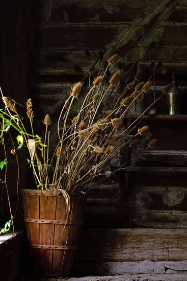
Do you find that hint of greenery on the left to be distracting? Other honest opinions on this are greatly appreciated.
A beautiful still life with lovely tones and textures Wendy. I find the light coming in very nice, but the green slightly distracting. The container looks as if it could topple over, I might have tried to straighten it a little. That is only my very personal opinion ;-)
I really like this, but do find the left edge a bit distracting. The bright light as much as the greenery. I'd experiment with a tighter crop. Keep current ratio, crop off left side to right at the edge of the pot... approximately center the result top-bottom....
I agree and if it were me I would clone out the green - I'm often dealing with distracting little bits in my images too and so I just make a copy and play about then compare to the original. That has helped me get my 'eye' in on what should stay or go.
I would only do a very small cropping on the bottom and left. It's a lovely image in the main part :)
I'm obviously the minority here but I like the green. It brings a pop of color to what would otherwise be rather monotone. The pot does look like it could use straightening but then you may find the lines on the right tilted. Not sure. And those lines are interesting. I would keep them. It's a very fine line to cross. The tilting of the flower pot would have to be sublime in its movement. I like this image. It's rustic, it's Mother Earth.
yes it is distracting, but not only because it interrupts the color palette,but it is blurry. it could have been made the subject of the photo but it clearly isnt here.
It is the blurry as much as the green that distracted me. On the other hand, I'd personally bring the color saturation down a bit. But that's just me, probably not in line with the average viewer,
@lsquared Thanks for bringing the attention of the window light as well, Larry. You are correct - it also distracts and probably exaggerates the attention on the greenery which might have just faded in the background without it.
@farmreporter That's so nice of you to say- it's really a matter of just playing with so many of mine own- fooling around is a way of storing up ideas. Glad you liked my fiddling here.
Write a Reply
Sign up for a free account or Sign in to post a comment.

I would only do a very small cropping on the bottom and left. It's a lovely image in the main part :)
details here- and once you see them, I'll take it off my project.
http://365project.org/olivetreeann/toys-on-365/2019-06-11
Thanks to everyone who took the time to comment. I greatly appreciate your input! 365 is such a supportive community!
So sorry for the mass reply!
I love how you are able to so quickly solve photo problems, Ann! Thank you so much for taking the time to do this.