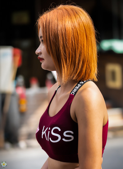
I have obviously been playing around with Lightroom and Photoshop and desaturated the background to this shot. What do members think? Does it enhance the photograph or otherwise?
It was a street shot, so what was captured is there; slightly more face would have enhanced the shot but there was no opportunity to do this.
The answer to your question is no, but I will have a look at doing that this afternoon. To be honest I am not a lover of monochrome photography. I tend to go for bright (and even gaudy) colours. In my view what makes this shot is the colour of the lady's hair coupled with her coloured top, I am of course open to all suggestions. Thanks for your suggestion above.
Hi John,
I really prefer the first one (without desaturation). The background is not disturbing because of the Depth of Field, and it includes colours spots which are in the same tonality that the Lady's hair and lips.
I also prefer the original. Desaturating has also toned down her glorious red hair. The lettering on her shoulder looks odd with the now grey letters. I agree with Vincent re depth of field. However, everyone has different perspectives, and there is no right or wrong. It is a lovely shot of this beautiful redhead
@vincent24 I second (third?) the vote for the original. Sometime desaturation is helpful, but in this case I think it makes her look a little unnatural. (Maybe you need to really need a strong contrast between color and B&W to make the technique explicit, or just leave the color in the background.) I have been known to use Camera Raw sometimes to desaturate only certain distracting colors a bit, maybe darken just the green a tiny bit, but in this case the background colors enhance the main subject.
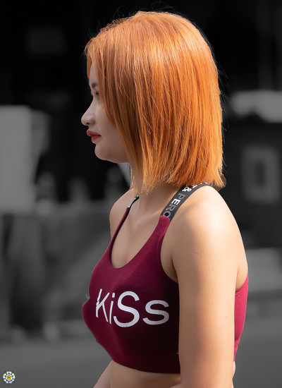
What you can do is tone down the colours rather than desaturate. The bright bokeh colours draw the eye away from the lady and compete against her . The desaturated image is better of the two but a toned down background might work better
I'm with Phil..You can just reduce the saturation of background without completely desaturating. Very often that is my favorite approach and I think it would work well here.
I occasionally desaturate the background partially, so that there main subject is emphasized, but the isolation is not so pronounced. My goal would be to keep a natural look. Like this: https://365project.org/lsquared/365/2018-02-13
I don't mind the second one but now you need to brighten her up a little to make her pop off the background. Her face looks too dark. Looks like when you desaturated you took her contrast along with it. You can really tell in her hair. Doesn't have the original punch the first one has.
I like the second one better as well. I often use a local adjustment to tone down the colors in the background. I like the second version better because the strong colors to the left seem to take my eye off the subject.
I'm not sure I would have removed all of the color, just toned it down some.
Good question.
Write a Reply
Sign up for a free account or Sign in to post a comment.

The answer to your question is no, but I will have a look at doing that this afternoon. To be honest I am not a lover of monochrome photography. I tend to go for bright (and even gaudy) colours. In my view what makes this shot is the colour of the lady's hair coupled with her coloured top, I am of course open to all suggestions. Thanks for your suggestion above.
Hi John,
I really prefer the first one (without desaturation). The background is not disturbing because of the Depth of Field, and it includes colours spots which are in the same tonality that the Lady's hair and lips.
I'm not sure I would have removed all of the color, just toned it down some.
Good question.